Rosewood Farms

Rosewood Farms Logo Design and Brands

Kentucky farmers at Rosewood Farms approached us with the need for a brand that would attract locals to their stand at the farmers market. We worked with our clients to understand their business and needs, and then we got to work developing a Starter Pack for the brand that would provide them with two options for look and feel. The options were each presented via a mood board, a farm logo, brand colors, and brand fonts.

Project Kickoff

We kicked off this branding project with an internal meeting to review the client’s needs. Prior to starting concept development or the logo design process, our clients completed a creative questionnaire to communicate key information to us. Through the questionnaire, we were able to learn that the most important aspect for our client was to come away with a more professional image for their farm.

Additionally, they noted that they were drawn to logos with cleaner lines and a symmetrical layout. We also learned that their core target audience included anyone who enjoys fresh produce and meats.

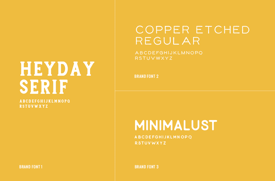
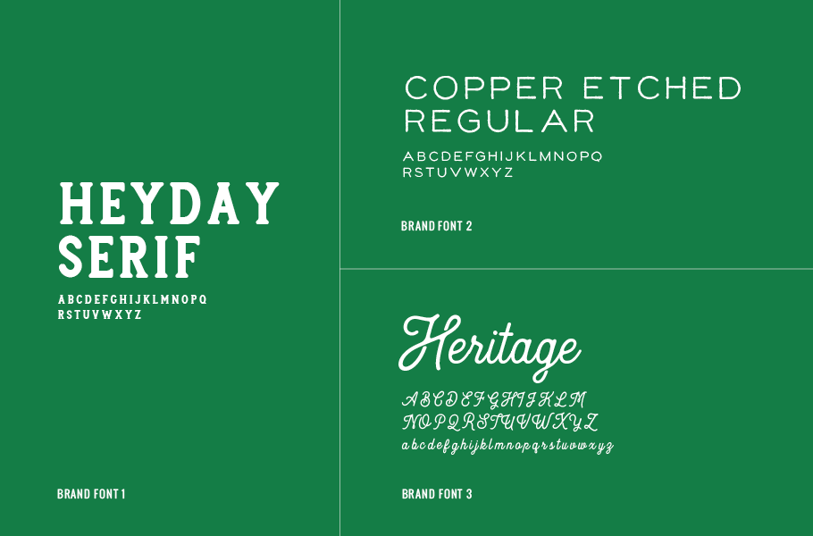
We set off with this information to create two brand options that we would present via a mood board, logo, supporting brand icons, brand colors, and brand fonts.

Design Direction Brainstorm

We started by strategically selecting two visual direction options for the project.

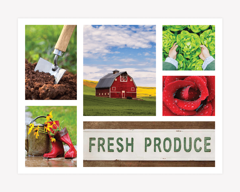
The first direction would be based on a vintage, yet updated farm style that incorporated elements from the earth in a graphic style. This direction would be bold and rich, with warm hues of earthy colors. The imagery would be indicative of life on the farm, and the products of the business would take center stage.

The second direction we would create would take on a markedly more modern aesthetic. This would be unlike the typical farmer’s market brand, and would instead take on a more iconic style. Light and bright colors would be utilized to bring in the freshness of the farm’s produce. Imagery would take on a more abstract vibe, playing on the people that bring the farm to life every season.

First Brand Concept Development

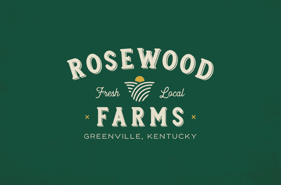
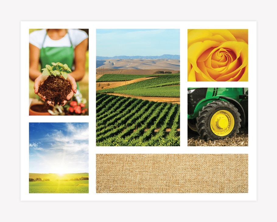
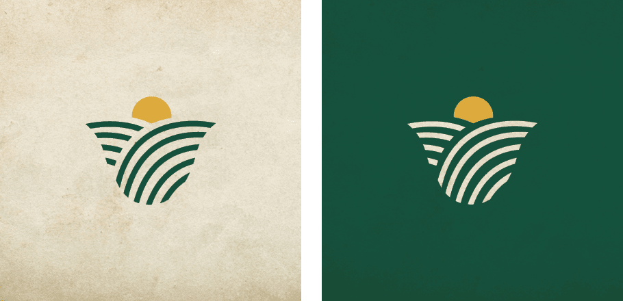
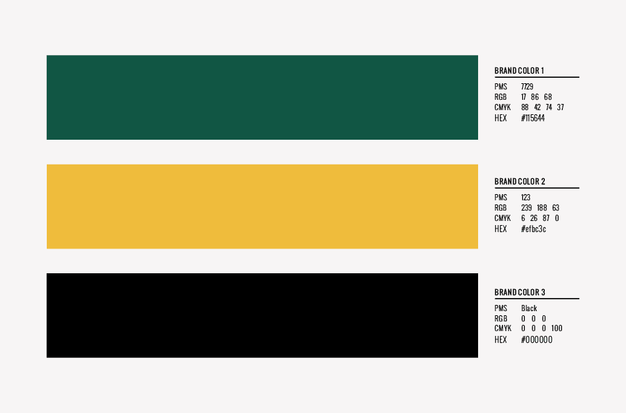
We created two brand concepts for Rosewood Farms and presented the concepts to our client through a mood board, logo design, supporting brand icons, brand colors, and brand fonts.

Rosewood Farms - Mood Board Nashville

Mood Board

The mood board for the first concept brought in images that reflected the natural greens and yellows that are present on the farm. This is seen through expansive images of fields with the sun peaking over the horizon, a closeup of the iconic John Deere tractor, and a visual of the interior petals of a yellow rose. A grounding burlap texture balances the aesthetic and aligns with the rougher nature of life on the farm.

Logo

The resulting logo was designed as a natural, graphic extension of the mood board’s visual direction. We utilized the shape of a rose to mirror the name and paired that with lines that were indicative of farmland. The rose petals are comprised of crop rows, which also form the shape of the rolling hills of Kentucky, while the rosebud at the center doubles as a sunrise over the farm. This logo icon was flanked by a vintage script font, noting the buzz terms “fresh” and “local.” The script typeface offsets the bolder typeface, used for the words “Rosewood” and “Farms,” and provided an opportunity for us to balance the logo and ground the icon, all within a vintage, seal logo design.

Rosewood Farms Logo Design and Brands
Rosewood Farms - Minimal Logo Designs

Brand Colors

The color palette for the brand would be comprised of a rich green, a warm yellow, and a solid black. These colors all related back to the earthiness of the brand, and the tones were kept warm to align with the desire to create a professional brand image.

Rosewood Farms - Brand colors

Brand Fonts

The selection of fonts to support the brand included a chunk serif, paired with a set of simple, yet stylistic sans serif fonts. The mixture of these fonts brought a current vibe to the brand, but one that would be seen as professional at the same time.

Rosewood Farms - Brand Fonts

Second Bran Concept Development

The second brand concept we created for Rosewood Farms was also based on the natural elements found on the farm. However, in this option, we brought in the traditional rose-red color to more directly identify the brand with the name, Rosewood.

Rosewood Farms - Branding Graphic Design

Mood Board

The mood board reflected this through the inclusion of a red rose, fresh with morning dew, as well as an iconic red barn. We also introduced images of fresh greens and rich soil. Burlap also was present in this mood board to bring in a natural neutral.

Logo

The logo created to align with this mood board was based around a rose-style graphic. The icon was created from two sloping hills and a red bud in the center. While this represented the leaves and petals of a rose, it was also indicative of the rolling hills of Kentucky and the sun shining over the farm. The logotype was placed symmetrically around the icon, and we implemented the location name into the logo to provide a vintage, yet modern feel. The terms “fresh” and “local” flanked the icon to provide further balance and to associate the brand with the farm’s key differentiators.

Rosewood Farms - Logo Design
Rosewood Farms - branding starter pack Nashville

Brand Colors

The color palette for this brand concept included a vibrant red and a bright, fresh green, accompanied by a richer green tone. The two greens represented the various seasons of growth and also served to create the hills which doubled as leaves in the logo icon.

Nashville web design - starter pack branding

Brand Fonts

Fonts for this brand would also include a bold serif and a more modern sans serif. However, this brand would also include a script font.

Rosewood Farms - starter pack for logo design

Presentation and Selection

Upon presentation of the two concepts, our client selected option one. They were taken with the manner in which the visual direction effortlessly combined the farmhouse feel with a bold, modern aesthetic. They also loved the way the concept showcased their farm and the products it produces. The yellow in the brand appealed to their tastes more, and the creative approach to the rose icon in the first brand concept was their preference.

Logo Finalization

With the concept selected, the farm logo went back to our Director of Design. At this point, she inspected the design to ensure that all elements were perfectly aligned and spaced. She then selected final logo colors, and these were identified in PMS, CMYK, RGB, and hex codes.

Additionally, color codes were selected for the supporting brand colors, and the font names were noted to send for client download.

Brand Guidebook

At the conclusion of the project, we created a brand guidebook, or brand booklet to ensure that our client had easy access to her mood board, logo guidelines, supporting brand icons, brand colors and color codes, and brand fonts.

Project Closeout

To close out the project, our graphic design team created new logo files. Logo files were provided to our client in PDF, EPS, JPEG, and PNG. In line with our process, we provided the logo in all white files, all-black files, and full-color files. The supporting brand icons were prepared for the client in a similar manner.

Additionally, we shared the mood board, color palette, and font names for the new brand through our brand booklet. When the brand elements were final, we moved into a secondary project that included the design of a custom trailer wrap, labels, and attire for the farm.

Ready for a Nice Brand?

If your business is in need of a strong start, or you’ve been working with a disjointed brand and are seeking some cohesion, give us a call. We’d love to start you off on the right foot.

are you ready to create something nice?