Alex Garza – Good To Be

alex garza blog logo

Social media influencer Alex Garza utilized our Nashville branding services to elevate her personal brand and her empowerment-driven clothing line called Good To Be. Her goal is to inspire women to create a life they love. Garza’s business has been fine-tuned to provide her audience with an encouraging platform where they can explore fashion, beauty, health, and wellness. Her unique brand and message are a wellspring of positivity for women nationwide.

Nashville Branding Services Project Kickoff

When our client approached our Nashville branding services agency, she was looking for an updated look and feel for her clothing brand and social media channels. Her social media channels on Instagram and YouTube were thriving under her name, Alexandrea Garza, but functioning separately from her clothing line, Good To Be.

Initially, she approached us for two new logos—one for her personal brand design and one for her clothing line. Upon initial review and strategy, we determined that connecting the two would strengthen her brand, so we recommended she pull both businesses under one brand umbrella.

To start off the project, our design team took a deep dive into the creative questionnaire to create a brief for our team.

The Nice Branding Agency creative questionnaire is a standard (yet sometimes customized, as needed) set of questions that we pose to our clients before we begin brand strategy or brand design.

Upon review of the completed creative questionnaire, our team was brought up-to-speed on Alexandrea’s goal for the project and vision for the brand.

We knew that the final brand design would need to be flexible. This flexibility would facilitate a connection with people on a wide variety of digital platforms. And practically speaking, the brand would need to be able to appear in a variety of instances — from a shirt sleeve to a youtube profile photo and everything in between.

An added complication for consideration was that some of our client’s work falls under the Good To Be piece and only relates to her clothing line. But other things are under both her name and Good To Be, depending on the outlet.

Additionally, we learned that Alexandrea’s Good To Be clothing brand was focused on cultivating a positive lifestyle through beauty, wellness, and fashion.

Her goal for the project was to create a recognizable brand for her clothing line as well as her social media content.

Design Direction Brainstorm

Whenever we provide Nashville branding services, we start with a team design direction brainstorm.

For the Alex Garza project, we first sat down to determine the most important considerations for the brand and how we could achieve the goal through visual implementation.

Sidenote: For larger projects, we start with Foundational Branding to decipher brand positioning, brand attributes, and visual direction. However, under the Starter Pack, we jump directly into the development of visuals based on the information provided by the client, and our own cursory research into the market.

For the Alexandrea Garza Starter Pack, our team worked through a design strategy session that resulted in two concepts that would be developed out into viable brand options.

Alexandrea’s messaging inspires women to create a life they love through positivity. In fact, her established tagline is: “Inspiring women to create a life they love.” Each piece in her clothing line has a motivating message. Together, her social presence and clothing line have created a community where women can find inspiration and knowledge to better their lives.

Based on this information, each of the two brand options would convey a sense of inspiration and empowerment for women.

We determined that the first brand option would emphasize the “good” aspect of her venture. We would use this brand to focus on positivity through fonts, colors, icons, and more that represented the inspiration Alexandrea brings.

For the second brand option, we would take a slightly modified spin-off of the tagline and focus on the “love” aspect. The resulting brand option here would be more of a fashion-forward, empowering visual direction.

With the brainstorming clouds full of ideas, it was time to get back to our desks and start creating. We knew from the creative brief that our client wanted to use light peachy-pinks, tan, white, nude, black, and grey in her color palette to keep it neutral, yet feminine.

First Brand Concept Development

As mentioned, the deliverables for the Starter Pack include two brand options, each one displayed through a six-image mood board, a custom logo design, supporting brand icons, a brand color palette, and brand fonts.

In developing each of the brand options, we start with the creation of the mood board. The mood board is a curated set of images that conveys the overall visual direction for the brand through imagery and colors.

The first brand concept was based on a calming and inspirational look and feel.

Mood Board

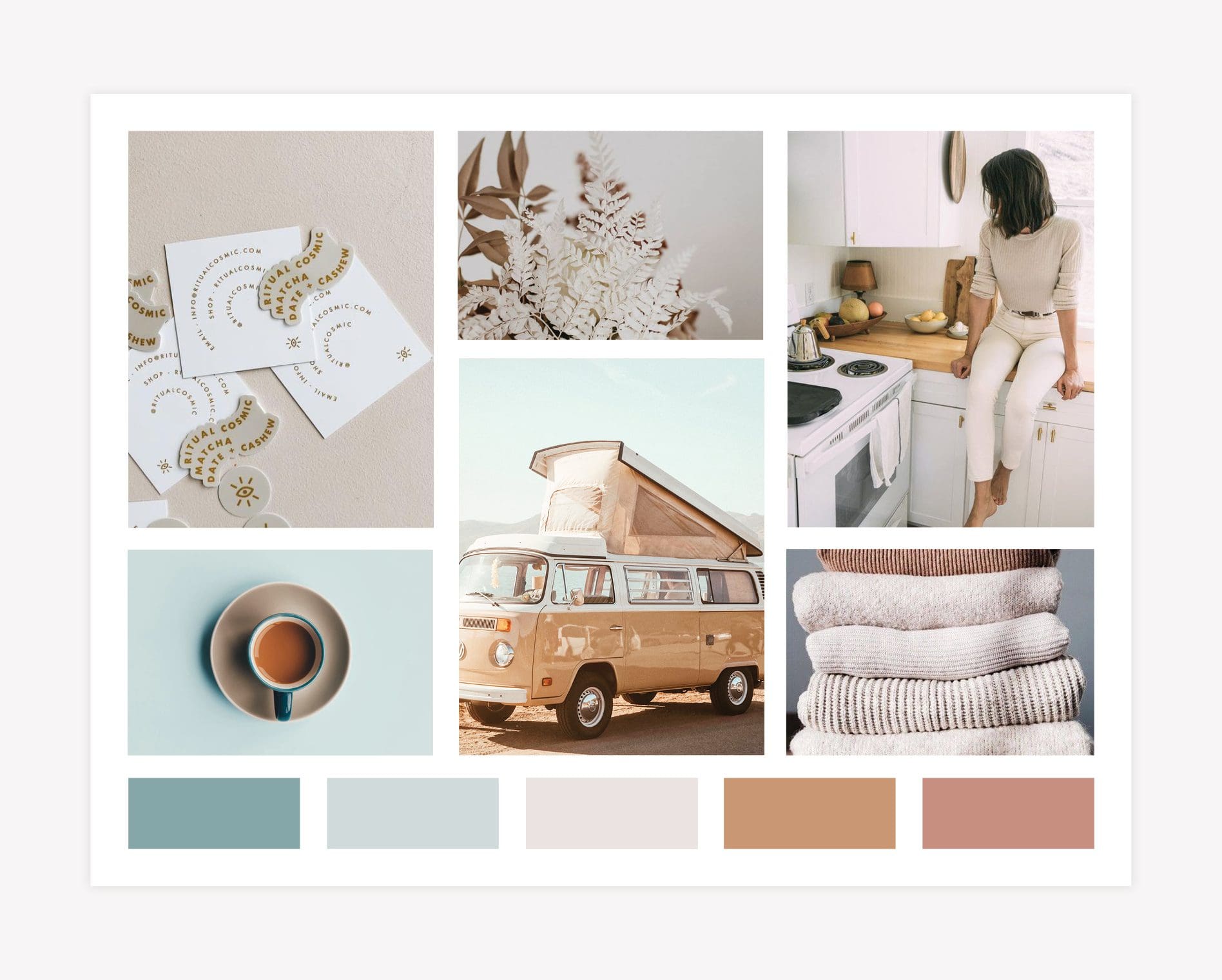
The mood board for the first brand option pulls in beachy images, neutral colors, and an overall peaceful, inspiring, vibe. The images together are feminine, but not excessively. While looking at this mood board, you are instantly transported to a place of restful relaxation.
Nashville branding services

Logo

Upon completion of the mood board, our team then moved into the creation of a logo design that would fit the brand.

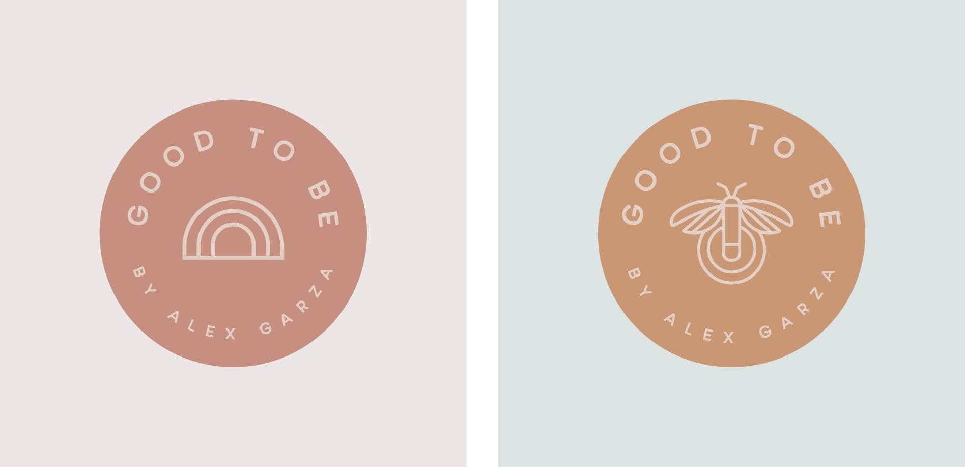
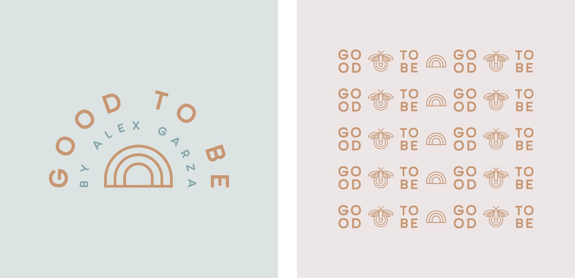
We determined that a priority for the final logo design was versatility. So, we created standalone logo icons (not all logos have or need separate icons!) that would allow the brand to exist in various applications. This was crucial, since the logo would need to represent the personal brand, as well as the clothing line.

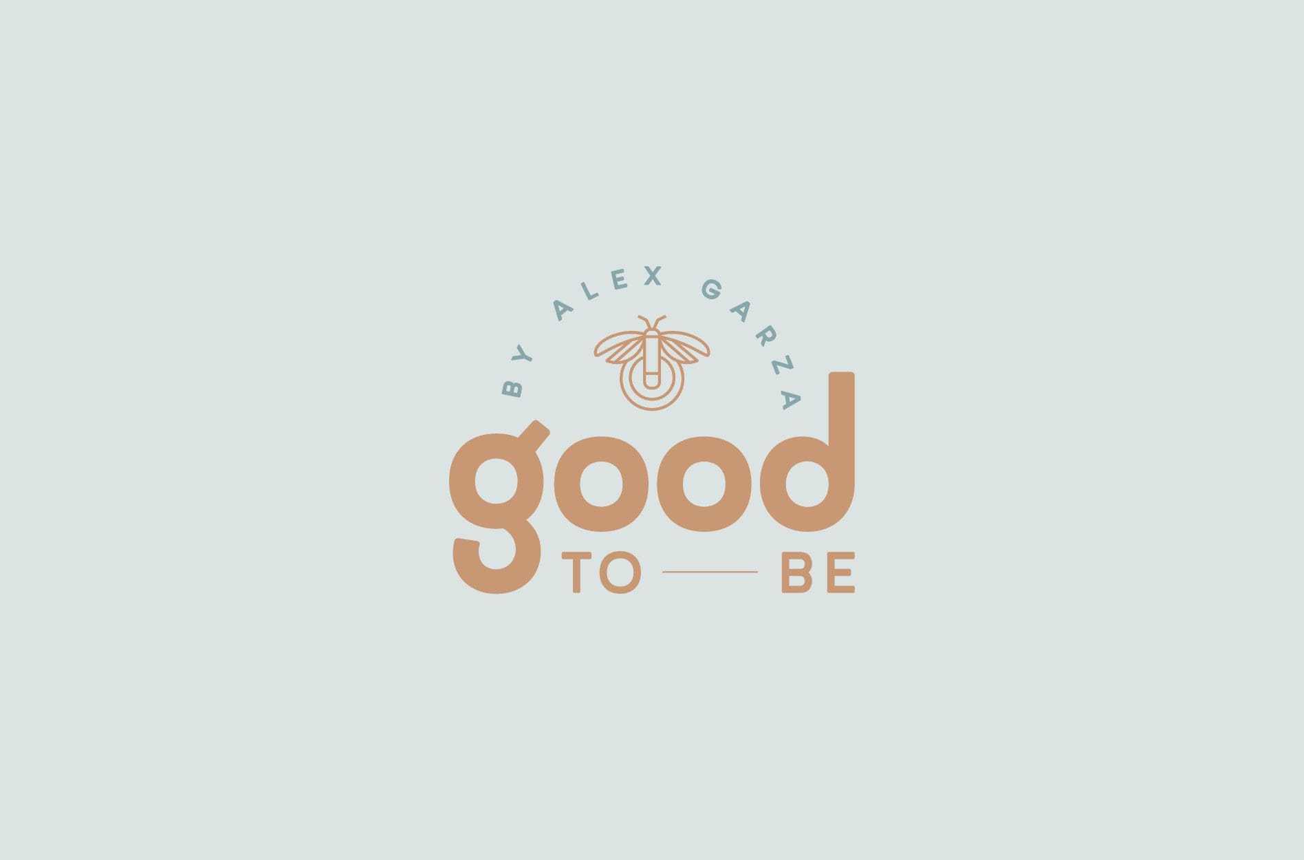
To focus on the feel-good positivity, we used firefly and rainbow icons to represent hope, illumination, and positivity. The rainbow and firefly became the supporting icons for the brand.

fashion blog logo design
Nashville branding services logo
logo design agency

Brand Colors | Nashville Branding Services

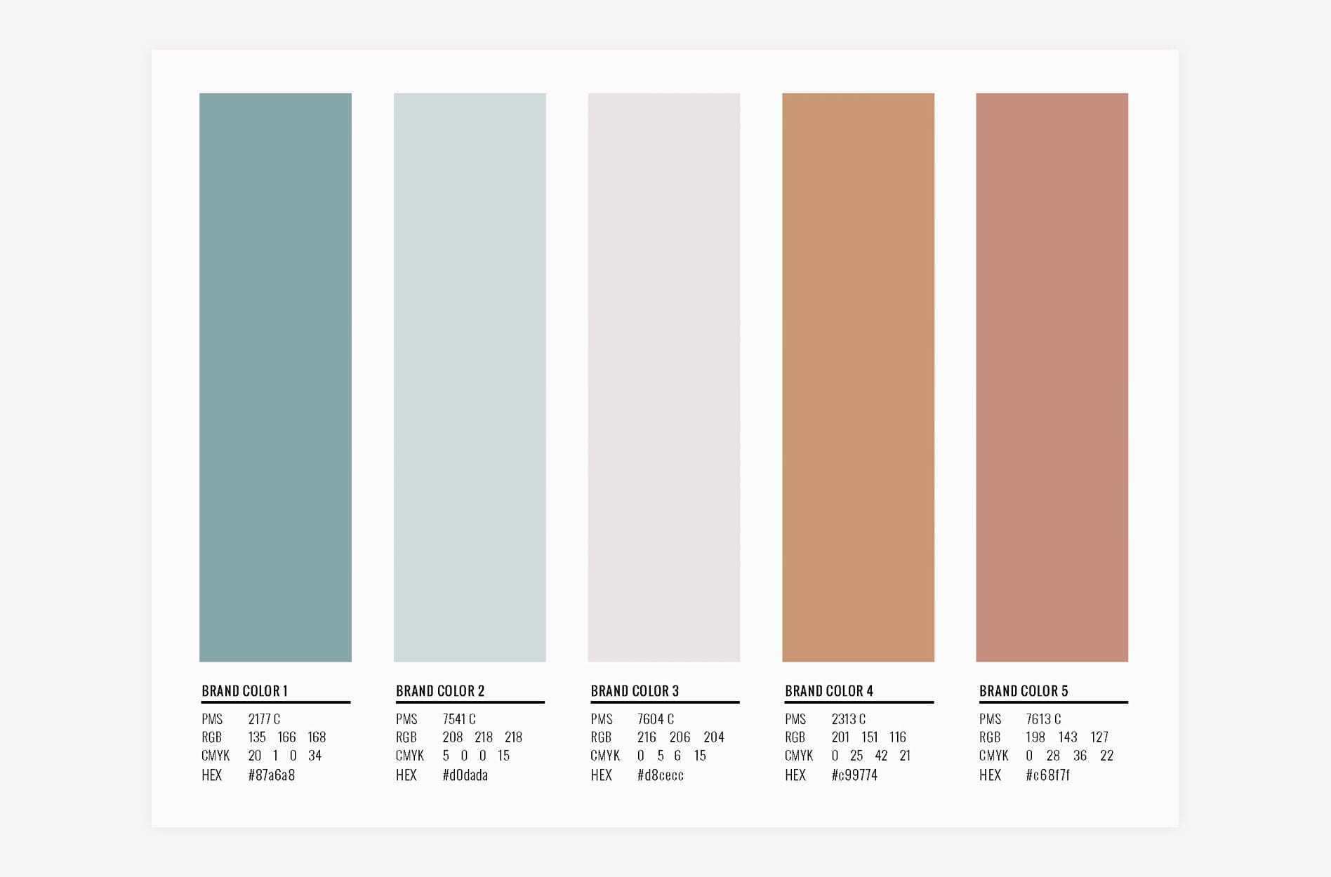
As part of our Nashville branding services Starter Pack, our team also creates the brand color palette. This includes both the logo colors, and supporting colors. The colors curated for this brand option are peaceful, inspiring, and neutral, aligning with the colors from the brand board. They are light and feminine, while remaining overwhelmingly neutral.

Nashville branding services graphic design

Brand Fonts

Finally, our team selects supporting brand fonts that pair well with the logo fonts, and convey the right message regarding the brand.

For Alexandrea Garza, we chose fonts that are friendly, clean, and modern. The primary brand font has a really simple and modern feeling, while the supporting fonts are more decorative, light, and friendly.

Overall, the first brand option highlights the inspirational health and wellness lifestyle that Alexandrea’s brand promotes. It encompasses the healthy wellbeing vibe through imagery and colors, while remaining down-to-earth and connecting with people who aspire to live the lifestyle.

Nashville branding services - fonts

Second Brand Concept Development | Nashville Branding Services

The second brand option in the Alex Garza Starter Pack also included a mood board, logo design, supporting brand icons, brand colors, and brand fonts. Additionally, the second brand option conveyed a message of empowerment and inspiration. However, as a slight departure from the first option, the second brand option would take on a more modern, fashion-forward, illustrative feel.

Nashville branding services - brand board design

Mood Board

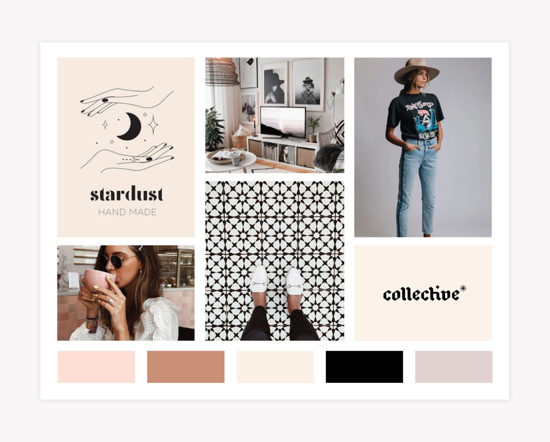
First up, we curated imagery to create a mood board that represented this vibe. We created a hip, trendy feel with more of a focus on style and empowerment, and the confidence that comes from that emphasis.

Within the mood board, we pulled in fonts that are classy and refined but have a curated, eclectic style.

Overall, this brand shows off an unashamed uniqueness of every woman.

blog-logo-design

Logo

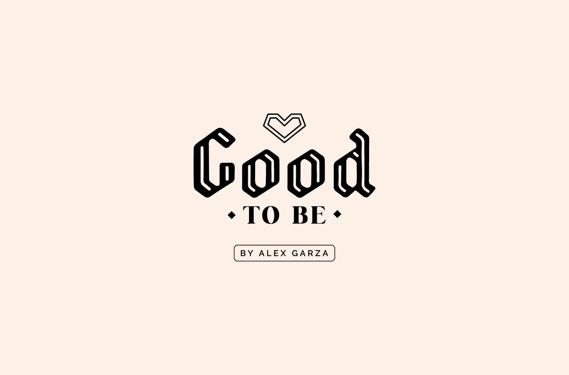
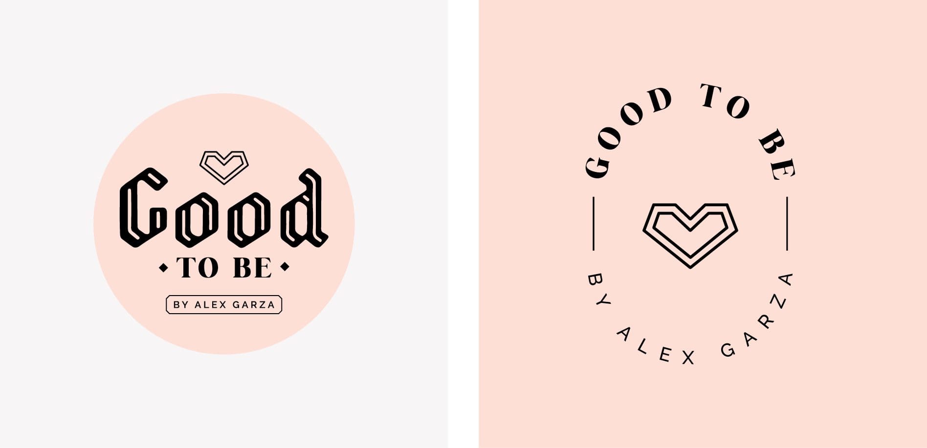
Based on the mood board, the logos for this brand are rooted in more styled, eclectic fonts. Again, versatility was important for this logo, so we developed several logo setups that would equip the brand with various options for application.

Note that the main logo can be used both with or without the tag, “By Alex Garza,” depending on the implementation. Since there would be times the logo would represent only the clothing line, this flexibility in setup was essential.

We learned at project inception that the logo would typically be used in a single-color application, so the layouts we created showed one-color options, sometimes against a flood of color.

To support the primary logo design, and to provide a mark for smaller applications, we created supporting brand icons. Again, not all logos require the support of additional icons. However, in this scenario, the icons would be key.


logo design agency nashville
icon design

The heart icon was designed to represent the brand promise to aid women in “creating a life you love.” The heart design can stand alone as a supporting icon, or become an alternate logo with the logotype positioned in an oval-shape around it.

A final setup was created to be used primarily for the personal brand, but could be used in other appropriate applications as well.

Since the application below doesn’t directly state the Good To Be name, it would have to appear alongside the Good to Be logos if it were to appear as a representation of the clothing line. However, it would prove useful for the personal Alexandrea Garza influencer branding.

alex garza brand logo

Brand Colors | Nashville Branding Services

We created this brand to be more feminine-feeling than the first. And the color palette would play a large role in bringing that to pass.

Since the logo designs primarily would be implemented in a single color, the brand color palette would be introduced through supporting brand elements.

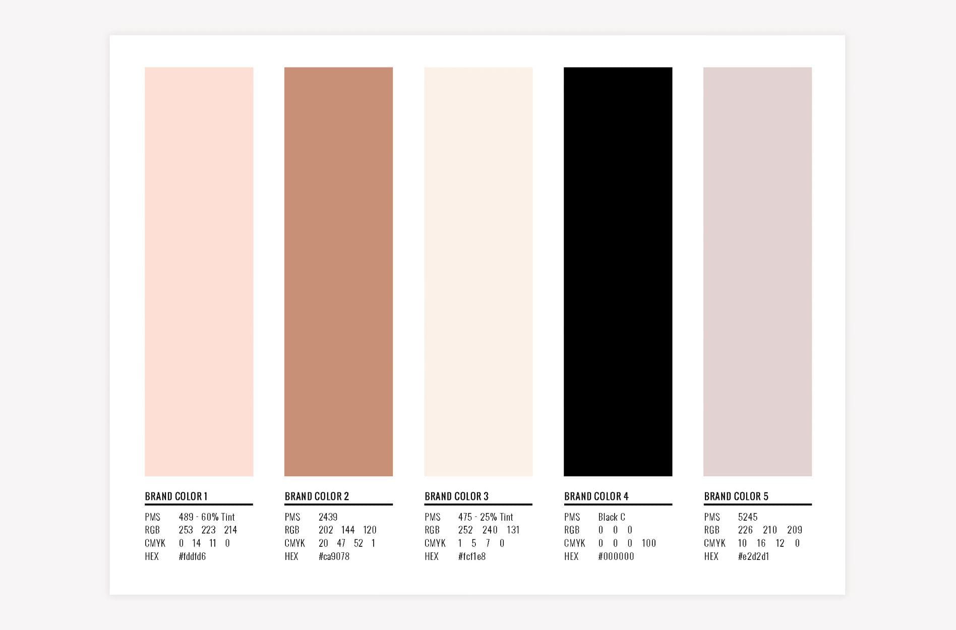
The colors here are still neutral and balanced, but the inclusion of varying shades of pink makes this palette more distinctly feminine than the first.

branding agency nashville

Brand Fonts

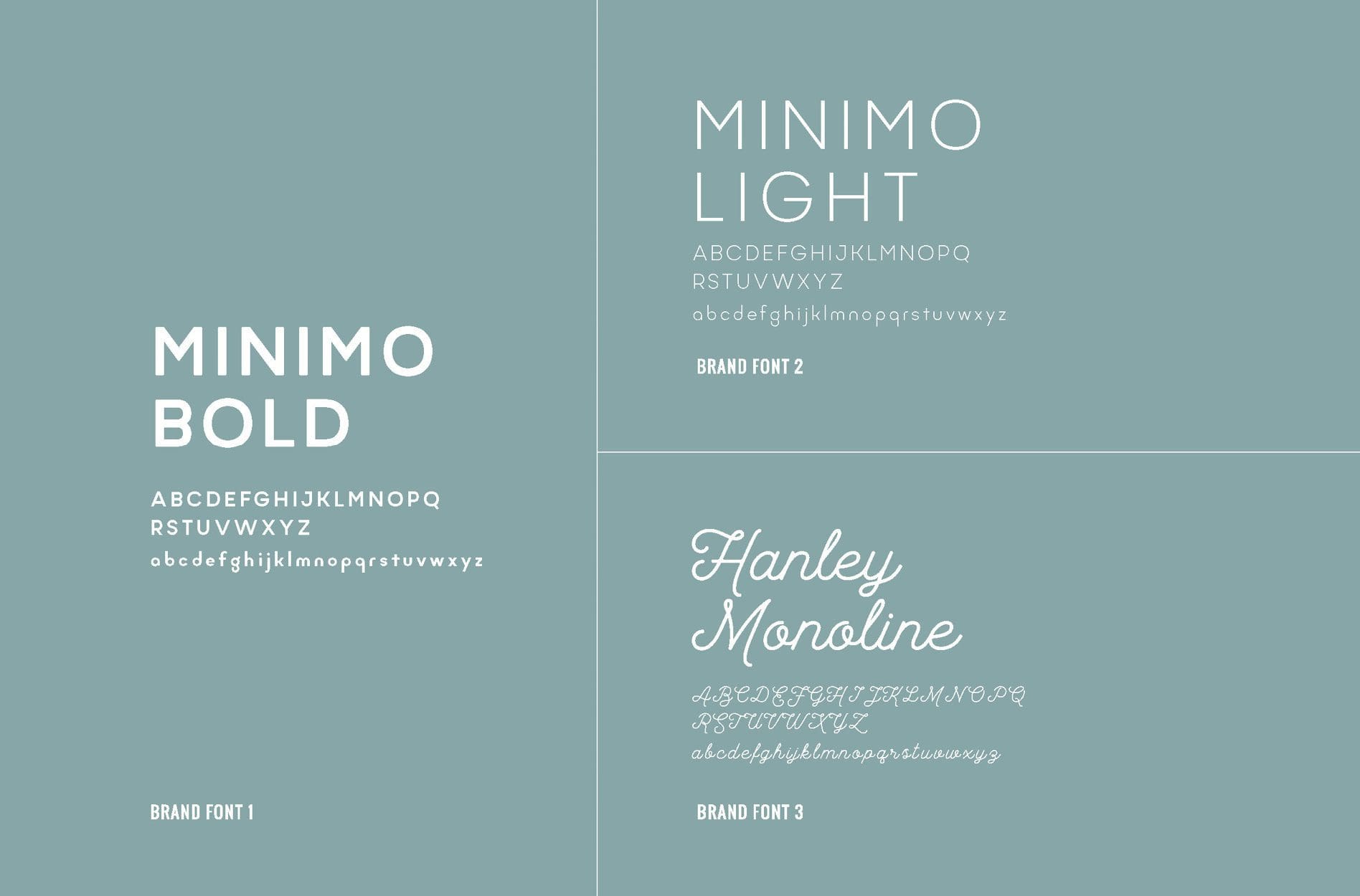
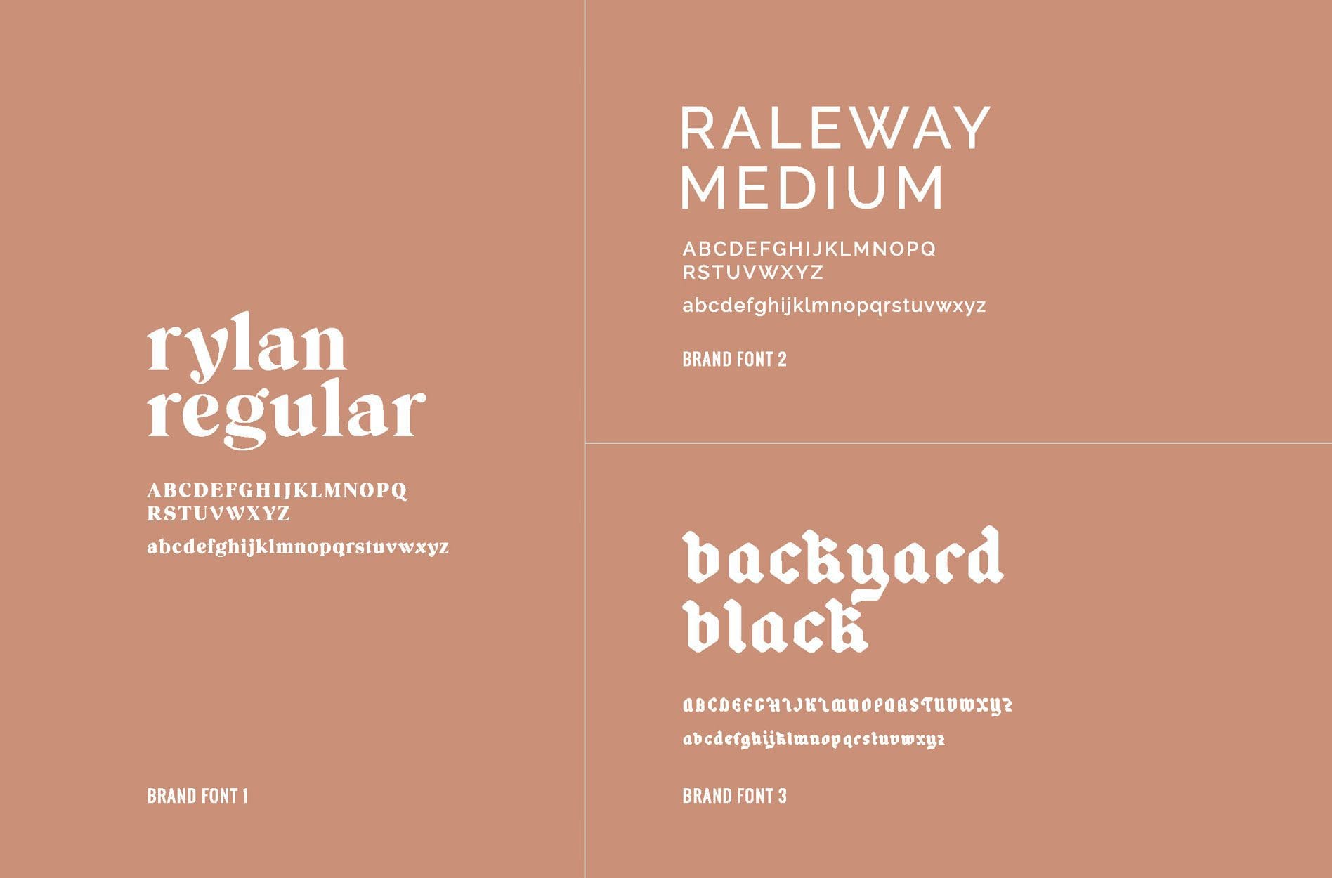
Finally, we selected a set of supporting brand fonts. For this brand option, we chose a more eclectic set of fonts than we picked for the first brand option.

In the guide below, Brand Font 3 is especially notable. While it is mostly used as a secondary font, it brings in the blackletter style that is really on-trend and current, which is a beneficial look for a clothing brand. This impactful font is balanced with Brand Font 1, which is uber-classic, and Brand Font 2, which is a distinctive san serif font that has a feminine feel to it.

Overall, this brand option conveys a more empowering and current message, while resonating with a female audience.

nashville graphic design

Presentation and Selection | Nashville Branding Services

As we prepared for the client presentation, we carefully considered the differences between the two brands and why we had made the distinctions between them.

We knew the chosen brand would have to be cohesive, yet flexible enough to join the two sides of Alexandrea’s business. Additionally, both brands communicated that Alexandrea creates inspirational content and fashion for women that encourages people to create a life they love.

However, the first brand option focused more on highlighting the inspirational feeling of her messaging, while the second presented a more fashionable and modern look.

Upon presentation, our client selected the second brand option. She felt that the first brand had a younger vibe, and that the second one would speak more to her target market, which is generally a 20 to 30-year-old woman interested in fashion, beauty, lifestyle, and creating a beautiful life.

Our team was stoked with her choice. We knew that it would make a really bold statement about who she is and what she does. We also knew that this direction would help her join her business into a cohesive and strong brand.

Logo Finalization

The logo files and icon files were provided in EPS, JPG, PNG, and PDF in full-color, black, and white. We also created a logo guidelines sheet to map out all of the appropriate uses of the logo.

Brand Guidebook

We provided our client with a brand booklet including the mood board for visual direction, final logo files, supporting brand icons, brand color codes, and brand font names.

Project Closeout

To close out the Starter Pack project, we sent Alexandrea all of her final files.

Like many of our clients, our work with Alexandrea Garza and Good To Be didn’t stop with the Starter. Once the brand was in place, we moved into the creation of a custom website where the brand would come to life in the digital space.

Looking for Nashville Branding Services?

We loved bringing our client’s vision to life through a bold brand. Do you have a vision for an inspiring venture? Let us build you a bold brand! Talk to the team today.

are you ready to create something nice?