
Wendy’s Interior Design Review by Nice Branding Agency
Awhile back, I tried a Wendy's burger for the first time as an adult. To my surprise, I really enjoyed the burger, but what really spoke to me during that meal was Wendy's environmental branding.
This inspired me to take a deep dive into the strategy that was put in place for their environmental branding and interior design, and take a deeper look a the touchpoints within the restaurant's interior that originally drew me in.
 I have always questioned why interior finished have to fall flat. Most owners blame it on budget issues but that's baloney. In my eyes, you're going to pay for the finish anyway. Today, we have so many options that are economical and aesthetically pleasing.
Wendy's is proof of this. Though they don't have the budget of a high-end restaurant, they still managed to make their interior presentable and pleasing to the eye.
I have always questioned why interior finished have to fall flat. Most owners blame it on budget issues but that's baloney. In my eyes, you're going to pay for the finish anyway. Today, we have so many options that are economical and aesthetically pleasing.
Wendy's is proof of this. Though they don't have the budget of a high-end restaurant, they still managed to make their interior presentable and pleasing to the eye.
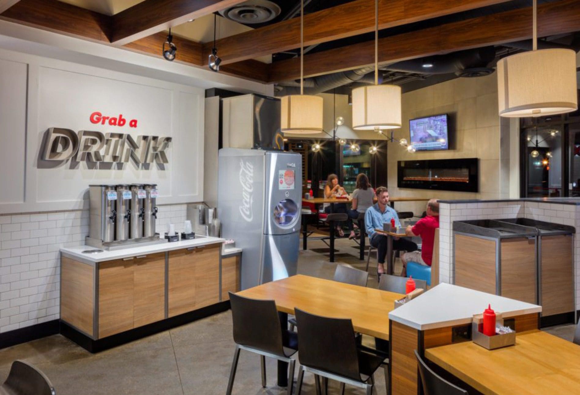
 Upon entry, I was greeted by a sign that helped me feel connected to where I was, not just the restaurant but the community. The sign featured die-cut raised letters and were mounted upon a tile wall. I truly appreciated the aesthetic appeal from the harmony of the colors, the design, and the variety of textures had a seamless appearance.
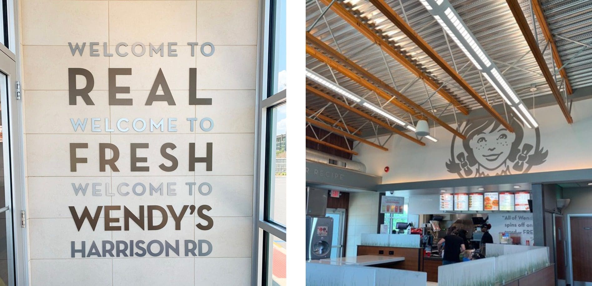
Then there's the Wendy's icon. It original is iconic but the update to the logo icon felt delicate and cordial. Seeing the icon blown up and displayed above the digital menu boards was music to my ears and candy for my eyes. I appreciate that the company stayed monotone with the color scheme so they didn't distract me from the menu options, but also gave me a subtle reminder of where I was.
The Wendy's icon didn't just become iconic by itself. Wendy's has been gingerly putting that thing in front of us for years now. They know what they're doing.
The signage extended throughout the dining room in that same manner described above. Nothing too fancy or over the top, but provided directives throughout my burger journey in a way that felt appropriate, neat, and modern.
Upon entry, I was greeted by a sign that helped me feel connected to where I was, not just the restaurant but the community. The sign featured die-cut raised letters and were mounted upon a tile wall. I truly appreciated the aesthetic appeal from the harmony of the colors, the design, and the variety of textures had a seamless appearance.
Then there's the Wendy's icon. It original is iconic but the update to the logo icon felt delicate and cordial. Seeing the icon blown up and displayed above the digital menu boards was music to my ears and candy for my eyes. I appreciate that the company stayed monotone with the color scheme so they didn't distract me from the menu options, but also gave me a subtle reminder of where I was.
The Wendy's icon didn't just become iconic by itself. Wendy's has been gingerly putting that thing in front of us for years now. They know what they're doing.
The signage extended throughout the dining room in that same manner described above. Nothing too fancy or over the top, but provided directives throughout my burger journey in a way that felt appropriate, neat, and modern.
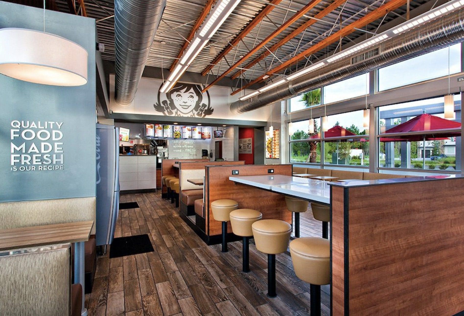
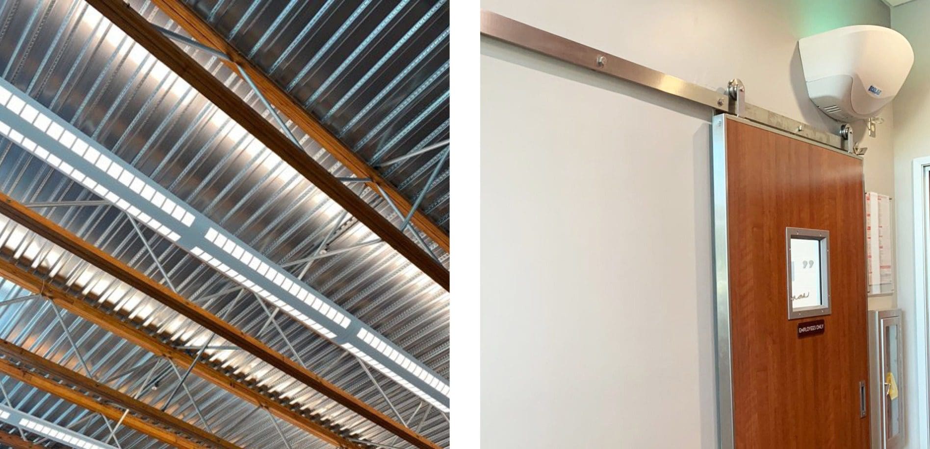 The ceiling consisted of a contemporary mix of wood and steel. The design evoked interest, but wasn't excessive. It was so nice not to see ducts that were dirty and dusty or broken ceiling tiles.
The ceiling was a modern mix of steel and wood. The design was just enough to evoke interest, but not overdone. More than that, I appreciated not seeing dusty ducts or dirty, broken ceiling panels. What I imagine to be intentionally designed, the continued nature of the horizontal joist took my eye on a ride that landed right back on that iconic logo icon.
As I explored more of the restaurant, I noticed doors that were on sliding hardware. You know, nothing monumental here, but just another detail that seemed modern and unique for a fast-food restaurant.
The ceiling consisted of a contemporary mix of wood and steel. The design evoked interest, but wasn't excessive. It was so nice not to see ducts that were dirty and dusty or broken ceiling tiles.
The ceiling was a modern mix of steel and wood. The design was just enough to evoke interest, but not overdone. More than that, I appreciated not seeing dusty ducts or dirty, broken ceiling panels. What I imagine to be intentionally designed, the continued nature of the horizontal joist took my eye on a ride that landed right back on that iconic logo icon.
As I explored more of the restaurant, I noticed doors that were on sliding hardware. You know, nothing monumental here, but just another detail that seemed modern and unique for a fast-food restaurant.
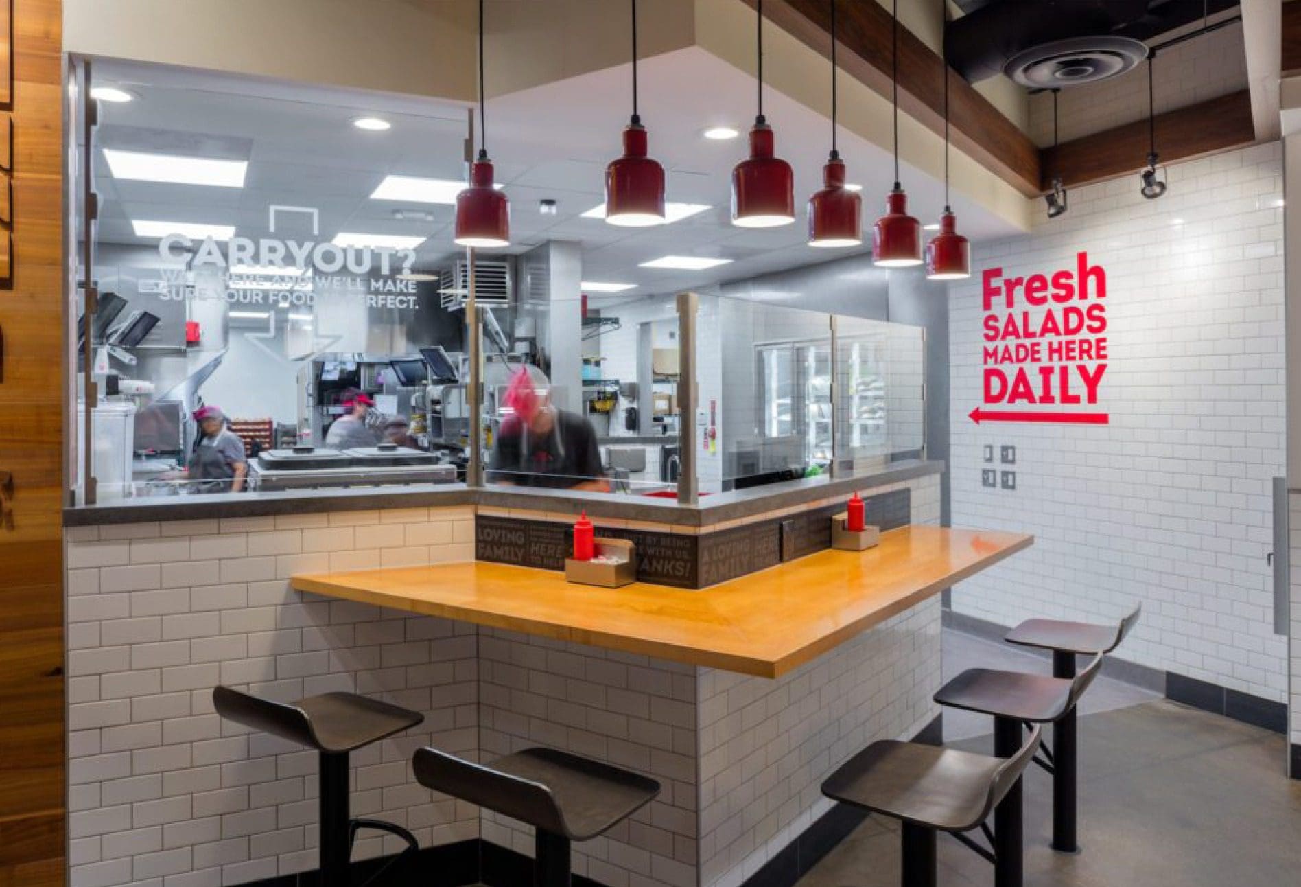 It's extremely rare to see a fast-food chain implement a concept like an open-kitchen. This can commonly be seen in fast-casual concepts but I think Wendy's may be a pioneer in making this a norm in fast-food concepts.
Life with smart phones requires charging, which we see in places like fast-casual eateries or anything airport-based but it's not super common to be seen at a fast-food concept. It is fast food after all.
It's extremely rare to see a fast-food chain implement a concept like an open-kitchen. This can commonly be seen in fast-casual concepts but I think Wendy's may be a pioneer in making this a norm in fast-food concepts.
Life with smart phones requires charging, which we see in places like fast-casual eateries or anything airport-based but it's not super common to be seen at a fast-food concept. It is fast food after all.
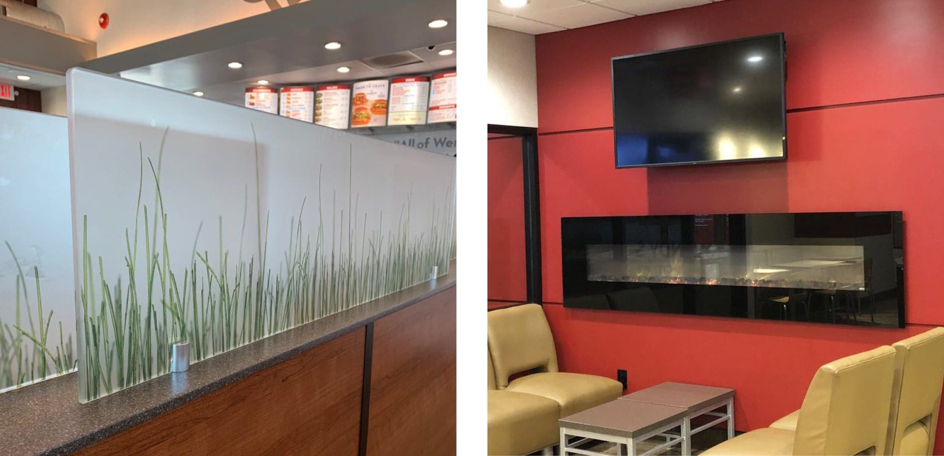 There was also an electric fireplace with a TV above it that was surrounded by furniture that looked a lot like a set-up that you might see at Panera and Starbucks. I can appreciate that Wendy's is trying to push boundaries in terms of restaurant design, especially for being a fast-food concept; however, this seemed too out of character for them.
The Backstory
During my research, I found that all this strategy was all part of Wendy's ongoing new store design. An article found on Skift Table solidified this by stating: "Several years ago, Wendy’s laid out a mission to start remaking its restaurants for the future. The plan involved a top-to-bottom reimagining of how restaurant design affects all parts of Wendy’s operation. Like the competition, Wendy’s is perpetually focused on driving success in a number of key ways, including increasing food sales and restaurant traffic and opening new locations. Store design affects those measures of success just as much as introducing a 50-cent Frosty to the menu."Wendy's Chief Development Officer, Abigail Pringle, is the one responsible for Wendy's new restaurant development as well as their existing restaurant remodeling. Initially, the design overhaul began several years back with an "image activation" initiative to update Wendy's existing restaurants.
WENDY’S INTERIOR DESIGN
A few thoughts that came to me as I sat and enjoyed my burger while quietly observing the interior restaurant design.Wendy's Environmental Branding: Interior Finishes
The interior finishes chosen felt elevated. For a fast-food concept, they were high-end and not exactly what one would expect to see at a Wendy's. Their finishes such as the wall tile, faux wood flooring, table tops and light fixtures are much more modern than most fast-food chain interiors. Even the booths wooden backs spoke to me, when usually they scare me away!
I have always questioned why interior finished have to fall flat. Most owners blame it on budget issues but that's baloney. In my eyes, you're going to pay for the finish anyway. Today, we have so many options that are economical and aesthetically pleasing.
Wendy's is proof of this. Though they don't have the budget of a high-end restaurant, they still managed to make their interior presentable and pleasing to the eye.
Wendy's Environmental Branding: Barstool Seating
The barstool seating were not the typical stools that you see at a fast-food concept that are generally left messy and that you must stabilize yourself prior to sitting down. Instead, they had stylized stools with leather coverings and were mounted into the floor. This seating wasn't typical and for that reason, I think it provided another point of interest to the design.
Wendy's Environmental Branding: Interior Signs
The style of the signage was uncomplicated yet sophisticated across Wendy's interior design. It was nothing excessive, but it was executed in a very classy way from the overall structure, signage materials, and what those signs actually said.
Upon entry, I was greeted by a sign that helped me feel connected to where I was, not just the restaurant but the community. The sign featured die-cut raised letters and were mounted upon a tile wall. I truly appreciated the aesthetic appeal from the harmony of the colors, the design, and the variety of textures had a seamless appearance.
Then there's the Wendy's icon. It original is iconic but the update to the logo icon felt delicate and cordial. Seeing the icon blown up and displayed above the digital menu boards was music to my ears and candy for my eyes. I appreciate that the company stayed monotone with the color scheme so they didn't distract me from the menu options, but also gave me a subtle reminder of where I was.
The Wendy's icon didn't just become iconic by itself. Wendy's has been gingerly putting that thing in front of us for years now. They know what they're doing.
The signage extended throughout the dining room in that same manner described above. Nothing too fancy or over the top, but provided directives throughout my burger journey in a way that felt appropriate, neat, and modern.
Wendy's Environmental Branding: Structural Finishes
The structural finishes that I saw in Wendy's interior design was shocking, but once again in a very good way.
The ceiling consisted of a contemporary mix of wood and steel. The design evoked interest, but wasn't excessive. It was so nice not to see ducts that were dirty and dusty or broken ceiling tiles.
The ceiling was a modern mix of steel and wood. The design was just enough to evoke interest, but not overdone. More than that, I appreciated not seeing dusty ducts or dirty, broken ceiling panels. What I imagine to be intentionally designed, the continued nature of the horizontal joist took my eye on a ride that landed right back on that iconic logo icon.
As I explored more of the restaurant, I noticed doors that were on sliding hardware. You know, nothing monumental here, but just another detail that seemed modern and unique for a fast-food restaurant.
Wendy's Interior Design: Bonus Points
A couple of other things that I found interesting with the design were the counter seating with a view of the kitchen and easy charging outlets at almost every table.
It's extremely rare to see a fast-food chain implement a concept like an open-kitchen. This can commonly be seen in fast-casual concepts but I think Wendy's may be a pioneer in making this a norm in fast-food concepts.
Life with smart phones requires charging, which we see in places like fast-casual eateries or anything airport-based but it's not super common to be seen at a fast-food concept. It is fast food after all.
THE NOT SO GOOD
There were very few things within Wendy's environmental branding that felt out of place; that being said, I would like to mention a couple things that felt a bit off base.Grass Glass Panels
In the dining room between tables, there was some glass paneling with grass graphics on them. I assume that these grass graphic panels were put in to provide privacy to diners within the space. They definitely fulfill a practical need, but the grass graphic specifically felt out of place.
There was also an electric fireplace with a TV above it that was surrounded by furniture that looked a lot like a set-up that you might see at Panera and Starbucks. I can appreciate that Wendy's is trying to push boundaries in terms of restaurant design, especially for being a fast-food concept; however, this seemed too out of character for them.
“We are trying to think differently and be creative in looking at where the communities are that we want to operate,” Pringle explained. “We want to figure out how to design for that opportunity, rather than saying, ‘Well, here’s Wendy’s, this is what we look like, and where can we fit?'”At Nice Branding Agency we always encourage our clients to push the limits, but with that we also provide a warning to stay true to who you are, and do not try to become something you are not.


