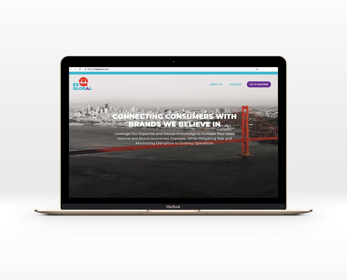
What Does Responsive Mean?
As a website development company, we often guide our clients through the process of determining whether they need a new website. There are several factors to take into account when assessing whether your website is serving you well. We’ve outlined some of these here but want to focus in on one aspect specifically.
When you’re auditing your existing website, or considering building a site for a new venture, one of the questions you should be asking yourself is whether your website is responsive.
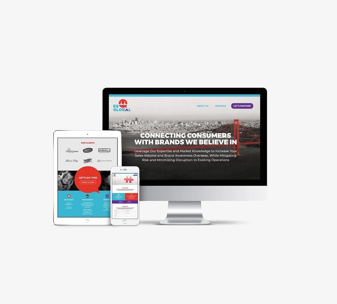
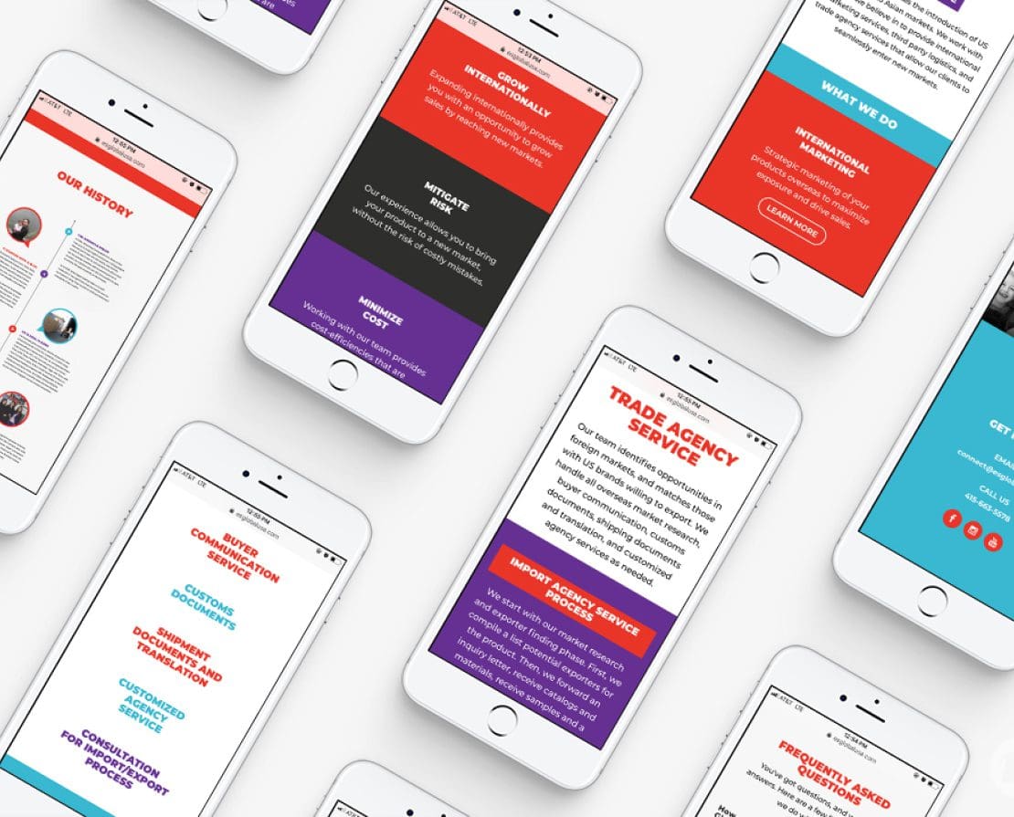

Website Development Company Explains: What is Responsive?
According to Wikipedia, “Responsive web design (RWD) is an approach to web design that makes web pages render well on a variety of devices and window or screen sizes.” In plain terms, our website development company explains responsive web design as the design and development of a website to ensure that it looks super-nice on most screen sizes. Primarily, we focus on creating a design that renders well on the most common sizes of desktop screens, laptop screens, and of course, mobile device screens.
Why Does Responsive Matter?
Statistics show that as of 2018, about half of the world’s web traffic is served on mobile devices. Half! That means that if your site doesn’t appear as intended on mobile, you could be turning off about half of your viewers. But, it’s not just that simple. Responsive web design impacts a variety of aspects pertaining to your web presence. We’ll start with the user experience. Users are unlikely to hang around if they can’t obtain the information they are looking for from a mobile device. If a user is unable to clearly read your text, see your images, toggle between pages, and make it to clear calls to action, they’ll bounce. Literally. If your website is not mobile responsive, you will experience higher bounce rates for sure. You see, even if your content is the bee’s knees, if users aren’t able to easily access and absorb it, you might as well just be saying “blah, blah, blah.” Now, back to bounce rates. If your website is generating high bounce rates, Google’s not going to prioritize bringing up your site in search results. Why? Because when people are bouncing from your website quickly, that says to Google that your content is not relevant to the search terms. In plain terms, your website didn’t provide the information the user was looking for. And Google is uber user-focused.Mobile Version Aversion
Now, some businesses think that they’ve found a clever workaround by building a second website that’s specifically for mobile. OK, we see what you’re doing there, and we do applaud the effort. However, there are unique problems that are presented with the “mobile website” strategy. First, with a separate mobile website, you’ve got to have a separate URL. Say what?! Right off the bat, I think we can all agree that two URLs doesn’t seem like a great idea. More importantly, with a separate website, you run into the issue of duplicate content. Managing duplicate content is a logistical nightmare and seriously impacts your SEO efforts. And not in a good way. When you release duplicate content out into the world wide web, Google is required to determine which content is more relevant. Ultimately, this dilutes the visibility of each of the websites and lowers your rankings for both sites on the search engines.
Mobile-Friendly is Not So User-Friendly
Another way that some have avoided the call to build a fully responsive website is by creating what is known as a “mobile-friendly” website. Sounds… friendly, right? A “mobile-friendly” website is basically your desktop site scaled down so it fits onto the teeny, tiny screen of a mobile device. So, basically, every element is shrunken down to minuscule size to fit on the screen. The text is tiny, buttons are miniature, and the user is forced to squint, pinch, zoom, and scroll to get to what they need. Yeah, not ideal. We all know what’s coming next. Poor user experience = high bounce rates = low rankings on the search engines = fewer customers = less money in your pocket. You get the idea.Social Sharing
Users, users, users. Our website development company is always talking about users. There’s literally no way to win with your website unless you take a user-first approach. You’ve got to consider all the ways people want to view and use your website, and then provide the perfect online environment for them to do so. These days, a big part of user experience online involves social media. As you consider sharing content on social, you will undoubtedly want to link back to your website. For this, you’ll need one URL that leads all users to a website that will be viewed optimally, whether the user is sitting at a desktop or scrolling through their phone. Social is just another thing to consider in terms of real-world, practical benefits of mobile responsive websites.