Free Flow Yoga | Logo, and Graphic Design
Based just outside of Brentwood, Free Flow Yoga is a fitness studio that’s home to a wide variety of yoga classes and high-energy bounce cardio sessions. Free Flow’s philosophy is that yoga is for everybody and every body. Every instructor is bent on making each person who steps through the studio doors feel welcomed and supported. And the space is equipped with rooms for both large and intimate classes, showers for freshening up, and wholesome snacks and pressed juices for fueling the fitness.When the Free Flow founders conceived the idea for a yoga studio that would defy all stereotypes, they knew they would need a bold brand to support the idea. They turned to the experts at Nice Branding Agency for yoga studio branding which included a visual direction, a brand identity, and brand support to capture attention and captivate yogis of all levels.
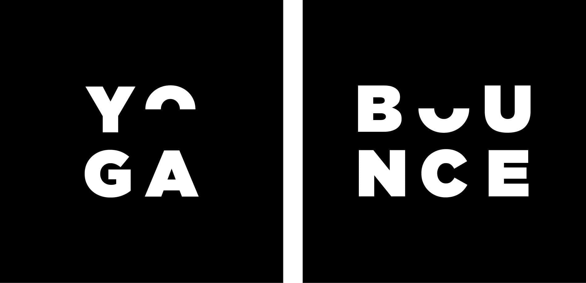
 Additionally, we created supporting logos for yoga and bounce. Each of the supportive symbols features the brand icon’s upward-sloping section in place of the letter “U” and “O,” respectively.
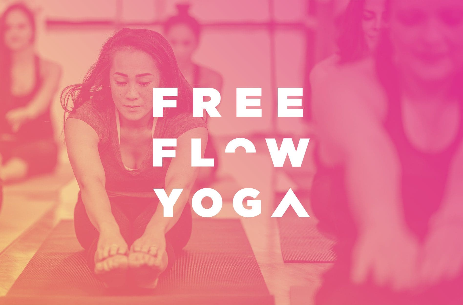
 Similarly, we provided a stacked typographic lockup that features the icon abstractly within the type. Here, the upside-down v is used in place of the letter “A” in yoga, and the upward sloping u shape is inverted and used in place of the “O” in flow.
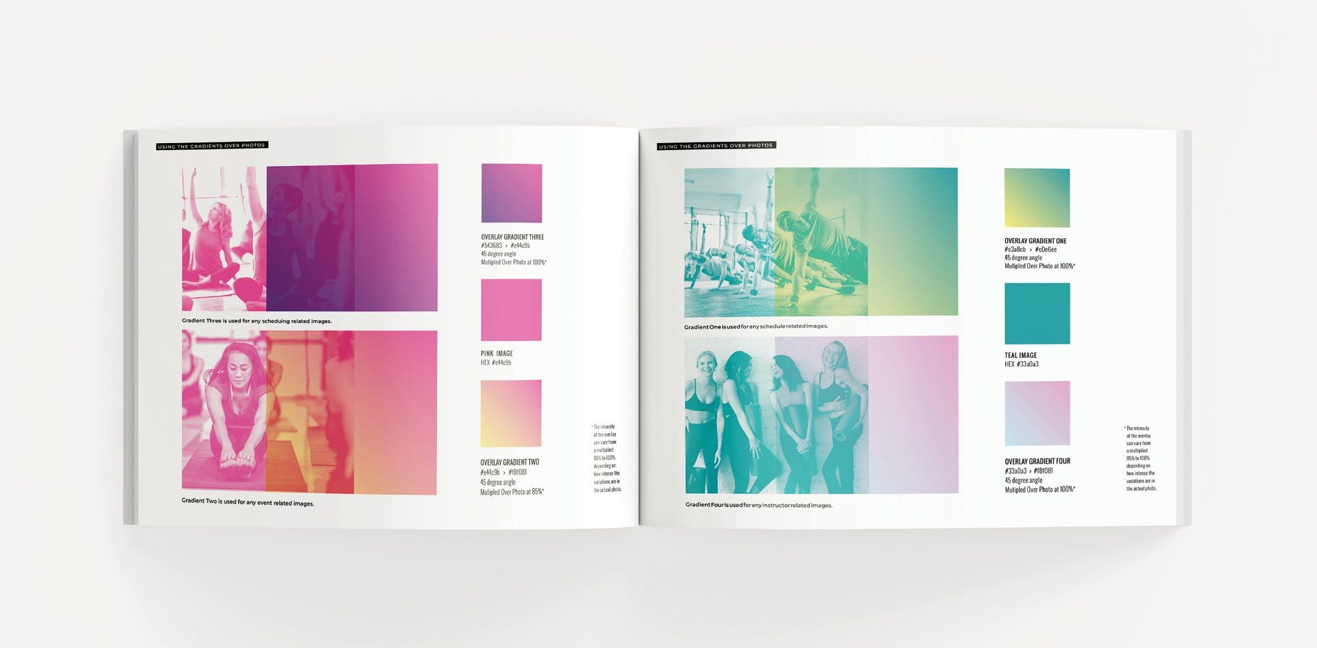
 Finally, in line with the visual direction, we developed a gradient system for the brand. This system includes four gradients with guidelines detailing how they should be implemented within this yoga studio branding project. The system and guidelines set the studio owners up for success by providing a pathway for implementing the brand elements consistently and correctly.
 Let’s take a tour of this stunning space so you can see how the brand is on display in every possible way.
Overall, we harnessed the power of juxtaposition. Neon lights against stark neutrals create impact throughout the interior.
Upon entering the studio, an almost entirely white space greets members. The expansive entry is punctuated by minimal, modern matte black furniture and fixtures. Neon lighting and floor graphics engage the eye immediately and draw attention to special spots.
 Community is key at this yoga studio. So, we were intentional about creating defined places for people to gather within the lobby area.
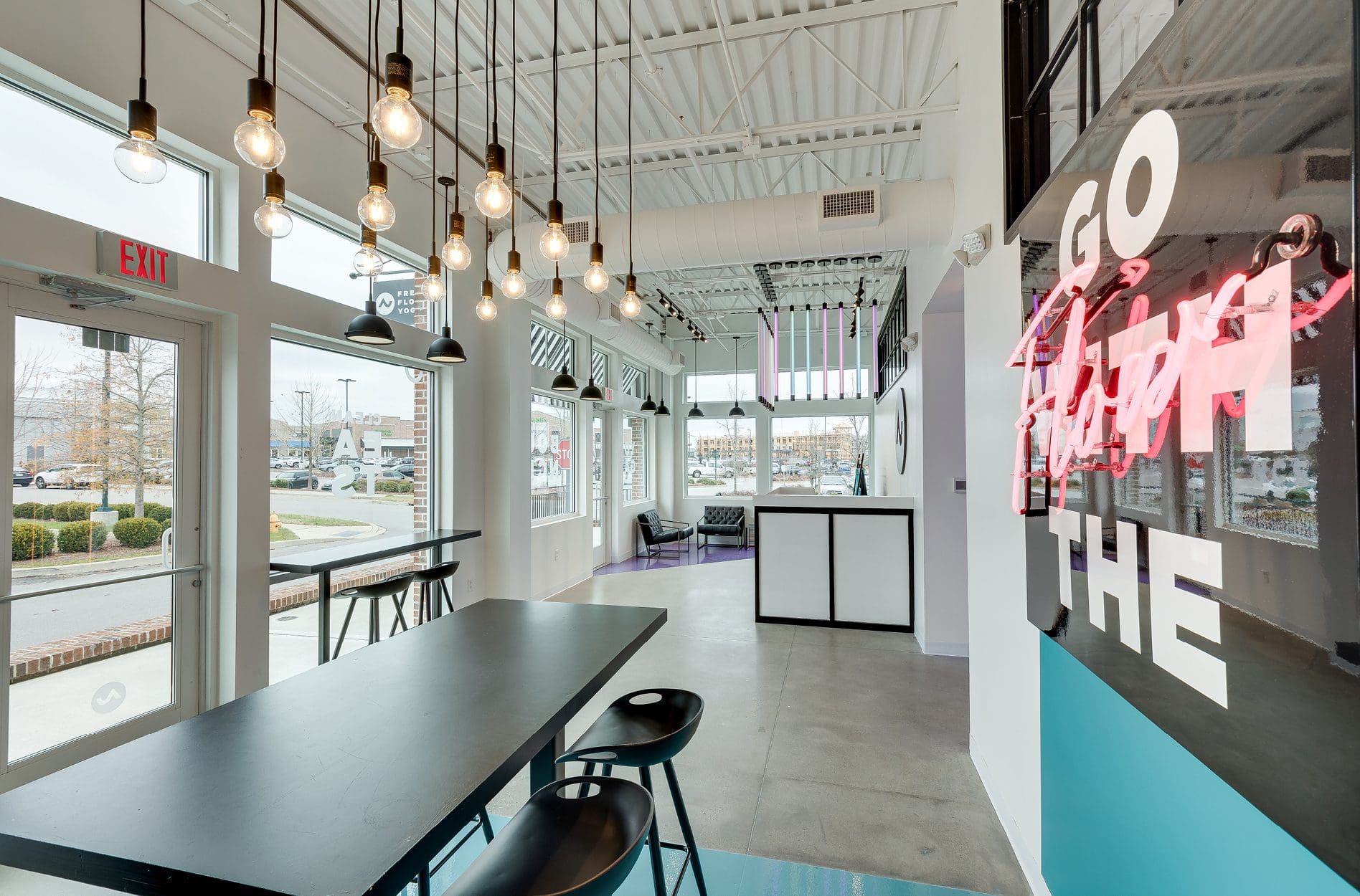
For example, to the right of the reception desk is the cafe. Here, a community table outfitted with barstools is centered over a large bright blue floor graphic. The graphic runs under the table and continues up the wall, drawing the eye up and emphasizing a custom box light design with a neon sign overlay. The sign conveys the brand messaging, “go with the flow,” which we’ve replicated throughout the brand. Above the table, 15 individual lightbulbs are strung up together to create one stunning fixture.
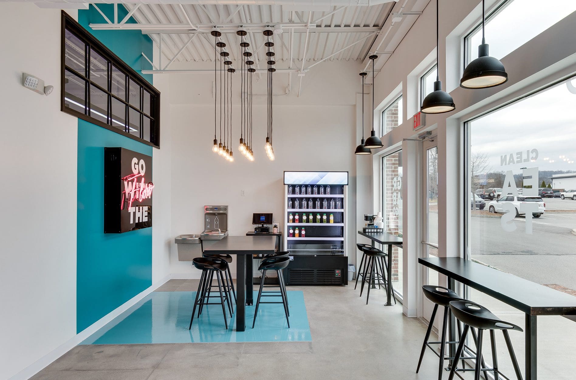 Against the windows in this space are twin bar seating areas flanking an exterior entrance. These spots are perfect for pairs of people, solo smoothie sipping, or laptop time. Modern industrial-style pendant lights illuminate the bartop and separate this space from the rest of the lobby.
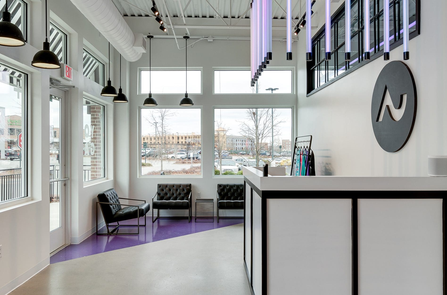
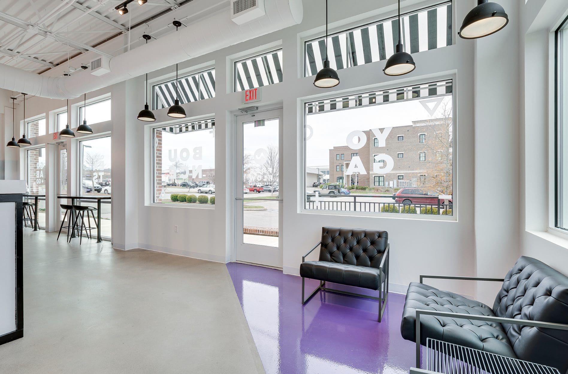
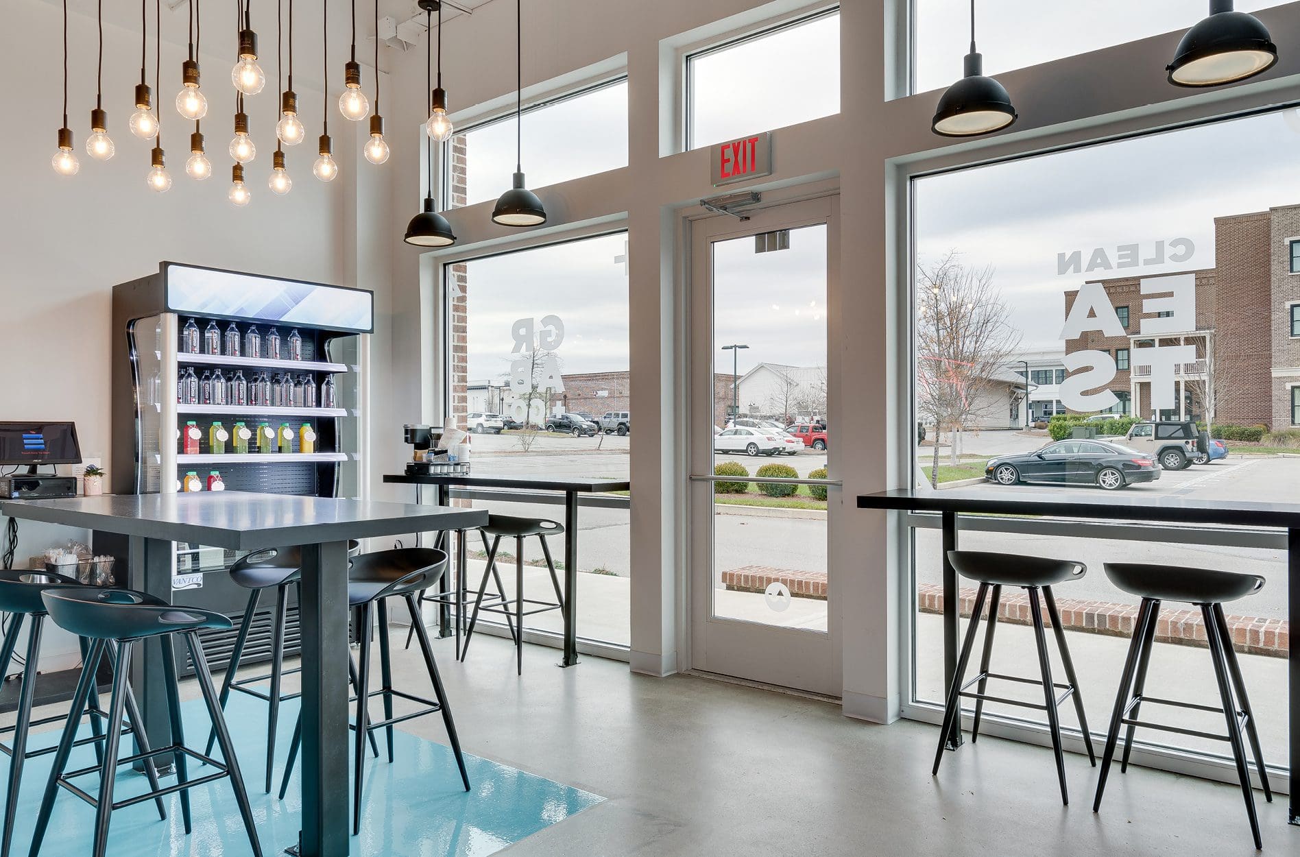 These pendant lights continue along the front windows, wrapping around to the left of the reception area where we created another lounge space. This area features modern, minimal leather arm chairs atop a geometric purple floor graphic. Here, members can peruse merchandise displayed on an industrial black metal stand or connect with one another before or after a class.
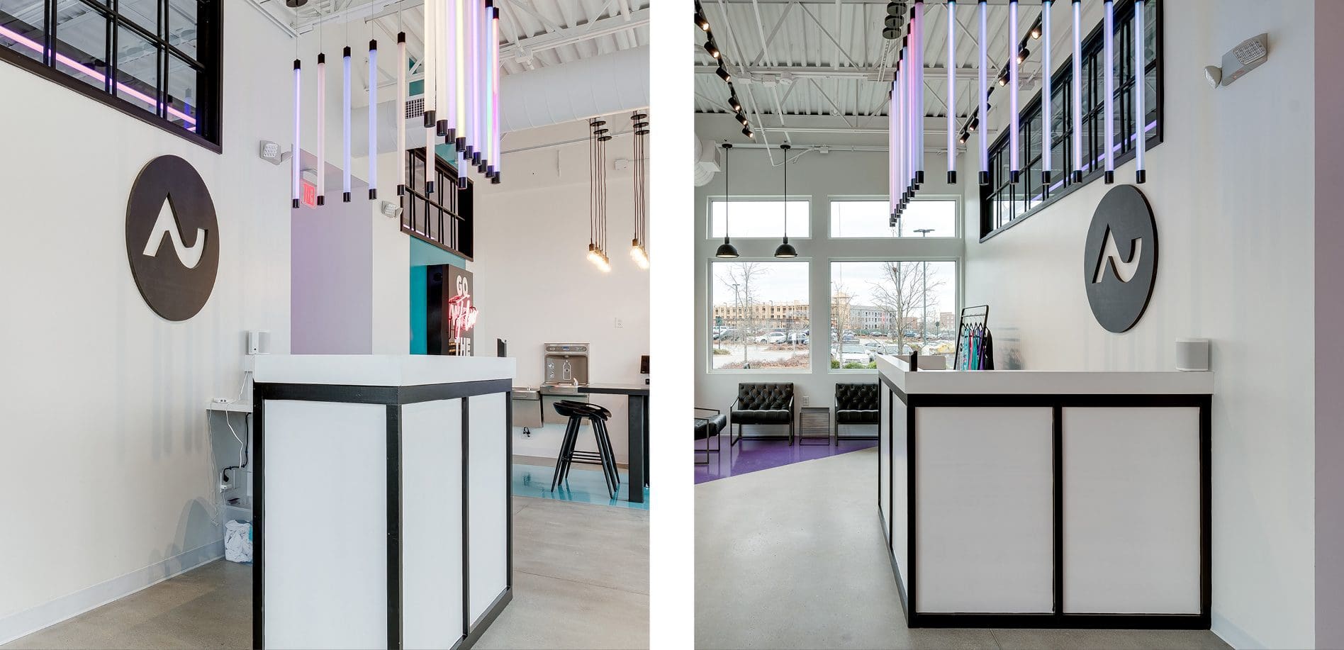
 At the center of it all is a custom-designed reception desk that really makes an impression.
The check-in station is illuminated by fluorescent neon light bulbs hung vertically, directly above the L-shaped desk. The logo icon behind the desk welcomes members and communicates to them that they are in the right place.
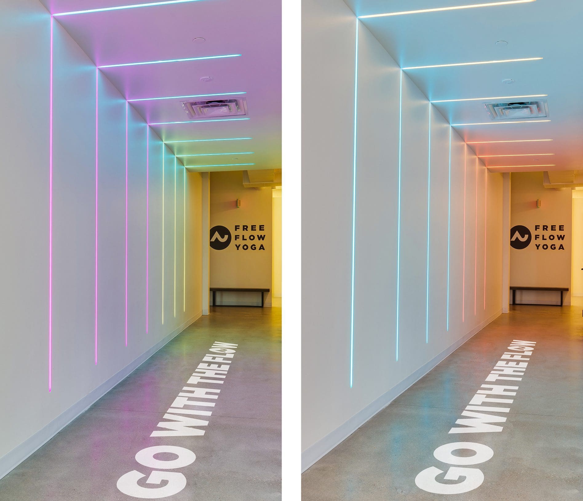
 A hallway leading from the lobby to the rest of the studio presented a powerful opportunity to connect with members. We designed neon lighting that would travel vertically up one wall and across the ceiling in an inverted L shape.
The lights can be set to any brand color or programmed to rotate through colors throughout the day automatically. The Free Flow Yoga hallway lighting is truly a custom installation that makes quite an impact. Hand-painted floor graphics in this space reiterate the “go with the flow” mantra.
 At the end of the hall, members can enter the locker rooms or head into one of the two studios for a class.
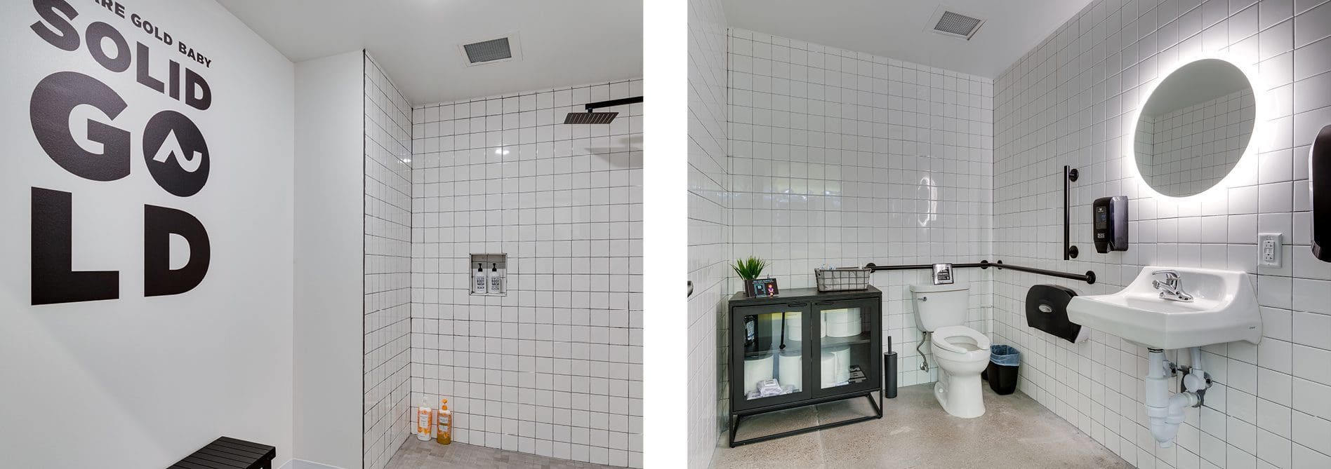
In the locker rooms, wall graphics convey brand messaging to a captive audience. On the walls and in the showers, square tiles with black grout and matte black fixtures align with the overall look and feel. To maintain the neon-light-show aesthetic, we selected a brightly backlit round mirror.
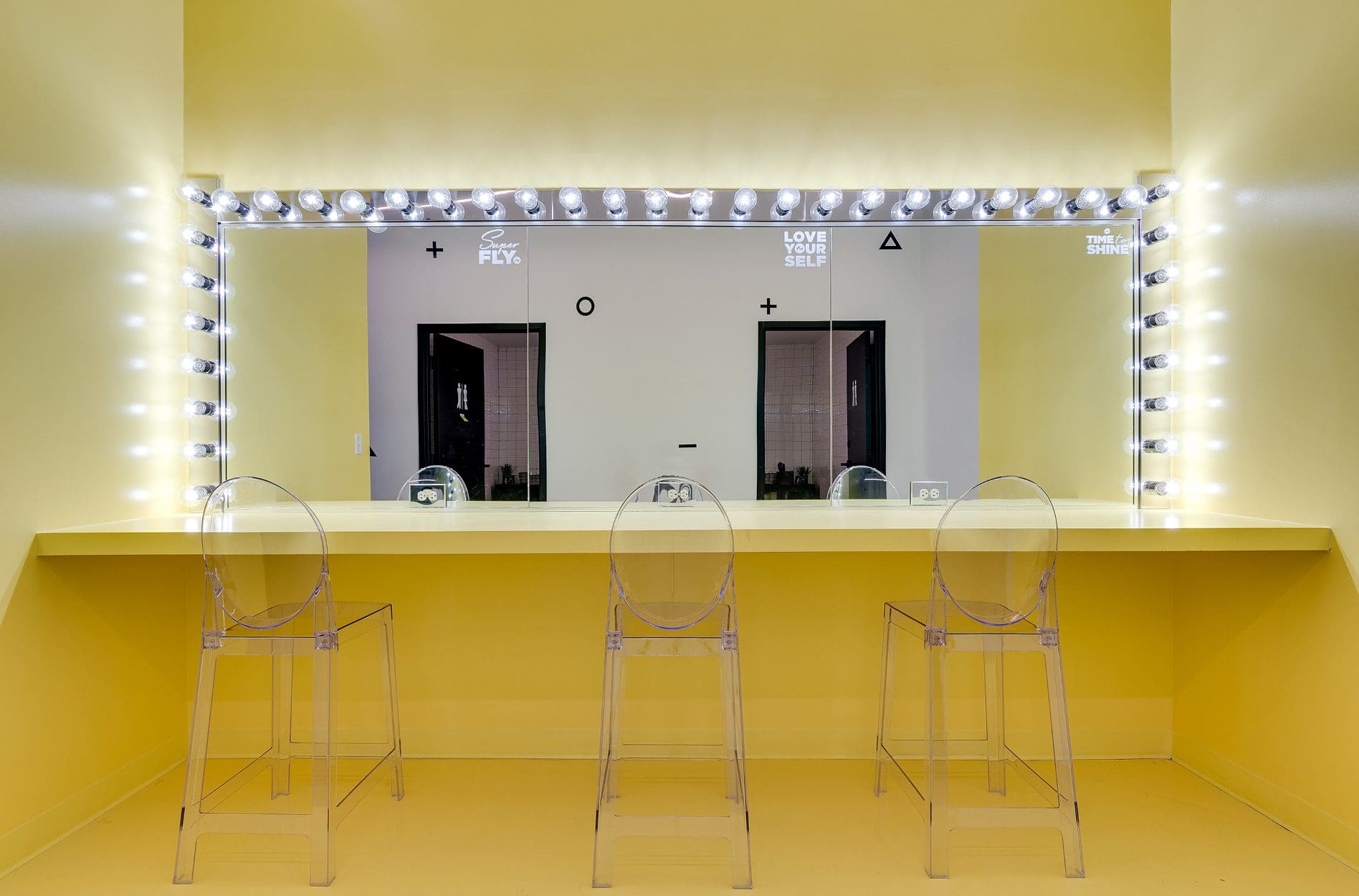
 Just outside the locker rooms, we created a space for people to sit and blow dry their hair or do their makeup. This station is flooded with bright yellow and lit with updated 80s-style vanity lighting. Using the brand color on the walls and floors, we defined the area, creating usable space where there wasn’t any before.
 With the studios, we kept the aesthetic pretty neutral. But we also took advantage of certain elements to maintain the non-traditional aspect of this yoga studio branding project.
First, we installed drop lighting around the perimeter of the ceiling. These lights are adjustable in color and intensity. This custom lighting feature gives instructors the power to customize the environment to suit the class vibes.
Also, a large brand icon takes up one wall, while the other wall features a subtle application of geometric brand shapes. The inclusion of brand marks within the studio generates brand awareness and creates easy opportunities for branded social media shares.
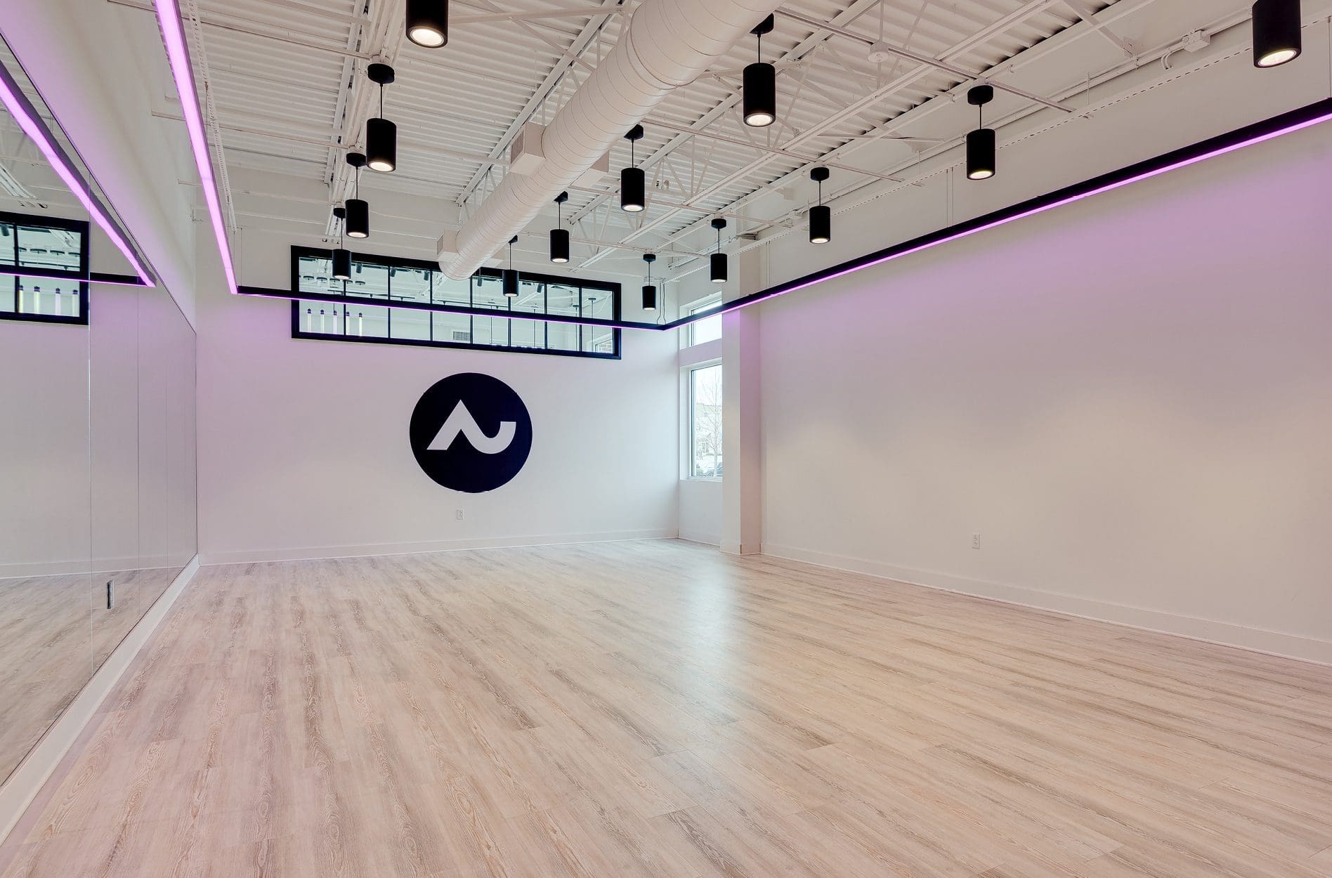 Overall, our selections for this space were modern and minimal. This approach allowed lighting to be the star of the show, effectively communicating Free Flow Yoga’s energetic, nontraditional, and welcoming vibe.



YOGA STUDIO BRANDING PROJECT KICKOFF
During our discovery phase, we researched to understand goals and differentiators. Additionally, we assessed the target audience. For this concept, the goal was to break the mold that constrained the typical yoga studio. Free Flow Yoga would cater to everyone. The studio would house yoga classes for newbies and long-time yogis. Free Flow would also offer bounce cardio classes with bumpin’ beats and fast-paced routines on mini-trampolines.BRAND DIRECTION
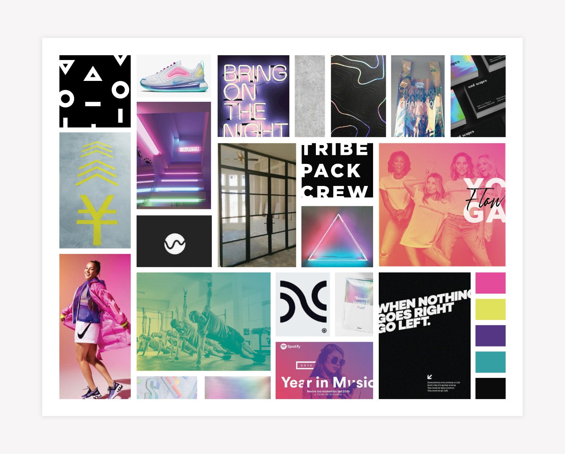
We created a brand direction for Free Flow Yoga that would blow the conception of a traditional yoga studio brand out of the water. The color palette includes bright shades of jewel tones. Neon colors against rich blacks or stark whites provide a contrast that conveys energy. Gradients come in through the color palette to introduce the concept of movement and a seemingly endless flow. The brand direction also features abstract shapes and lines. This graphic treatment parallels yoga poses to create a connection between the visuals and the service offerings. The imagery reflects a diverse group of happy, healthy people who connect both inside and outside the fitness environment. Patterns are holographic or neon in nature and provide a reflective element that pairs with the brand’s fluid personality. Finally, bold sans serif fonts are attention-grabbing and on-trend. The overall vibe communicates individuality and energy, aligning with the brand’s mission and values.
LOGO DESIGN
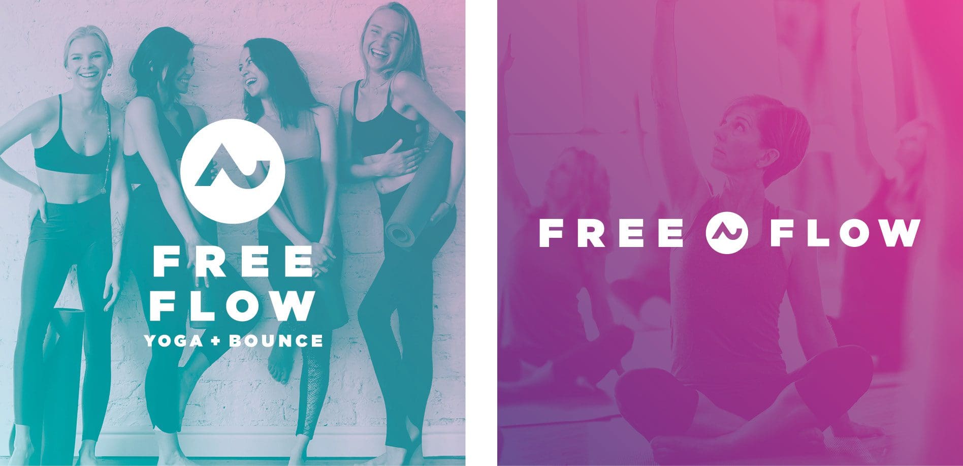
Based on the approved visual direction, we created a custom logo design for the studio. The logo design includes a clean, bold sans serif font like the one shown on the brand board. Our logo designers paired this type with an icon that mimics a wave representative of life’s flow. Additionally, and maybe more directly, the wave design is indicative of a downward dog pose, connecting the icon to the brand’s offerings. Like yoga itself, the logo system is fluid and flexible. Various versions provide ample opportunities to showcase the brand in different applications. For example, the horizontal logo setup works well in specific spaces, while other areas are better suited to the stacked version.
 Additionally, we created supporting logos for yoga and bounce. Each of the supportive symbols features the brand icon’s upward-sloping section in place of the letter “U” and “O,” respectively.
 Similarly, we provided a stacked typographic lockup that features the icon abstractly within the type. Here, the upside-down v is used in place of the letter “A” in yoga, and the upward sloping u shape is inverted and used in place of the “O” in flow.
 Finally, in line with the visual direction, we developed a gradient system for the brand. This system includes four gradients with guidelines detailing how they should be implemented within this yoga studio branding project. The system and guidelines set the studio owners up for success by providing a pathway for implementing the brand elements consistently and correctly.

YOGA STUDIO BRANDING | INTERIOR DESIGN
At Free Flow Yoga, there was an enormous opportunity to bring the brand to life in a three-dimensional manner through interior design. In each of our corporate interior design projects, our goal is to immerse the audience in the brand visuals and messaging, creating a genuinely connective experience. This experiential approach to branding engages all senses and makes for a memorable and magnetic encounter. We start by creating an interior design plan. We reference the floorplan to pinpoint lighting, furniture and fixtures, flooring, wall graphics, paint colors, signage, and more during this phase. We consider every single square inch of the space during this process because each segment of the customer journey is another opportunity to connect. As we unleashed our interior design expertise for Free Flow Yoga, we created a story using layers of light to communicate a position of fun, bold, and welcoming energy. In fact, when you step into the space, it’s like stepping into a light show. Let’s take a tour of this stunning space so you can see how the brand is on display in every possible way.
Overall, we harnessed the power of juxtaposition. Neon lights against stark neutrals create impact throughout the interior.
Upon entering the studio, an almost entirely white space greets members. The expansive entry is punctuated by minimal, modern matte black furniture and fixtures. Neon lighting and floor graphics engage the eye immediately and draw attention to special spots.
 Community is key at this yoga studio. So, we were intentional about creating defined places for people to gather within the lobby area.
For example, to the right of the reception desk is the cafe. Here, a community table outfitted with barstools is centered over a large bright blue floor graphic. The graphic runs under the table and continues up the wall, drawing the eye up and emphasizing a custom box light design with a neon sign overlay. The sign conveys the brand messaging, “go with the flow,” which we’ve replicated throughout the brand. Above the table, 15 individual lightbulbs are strung up together to create one stunning fixture.
 Against the windows in this space are twin bar seating areas flanking an exterior entrance. These spots are perfect for pairs of people, solo smoothie sipping, or laptop time. Modern industrial-style pendant lights illuminate the bartop and separate this space from the rest of the lobby.
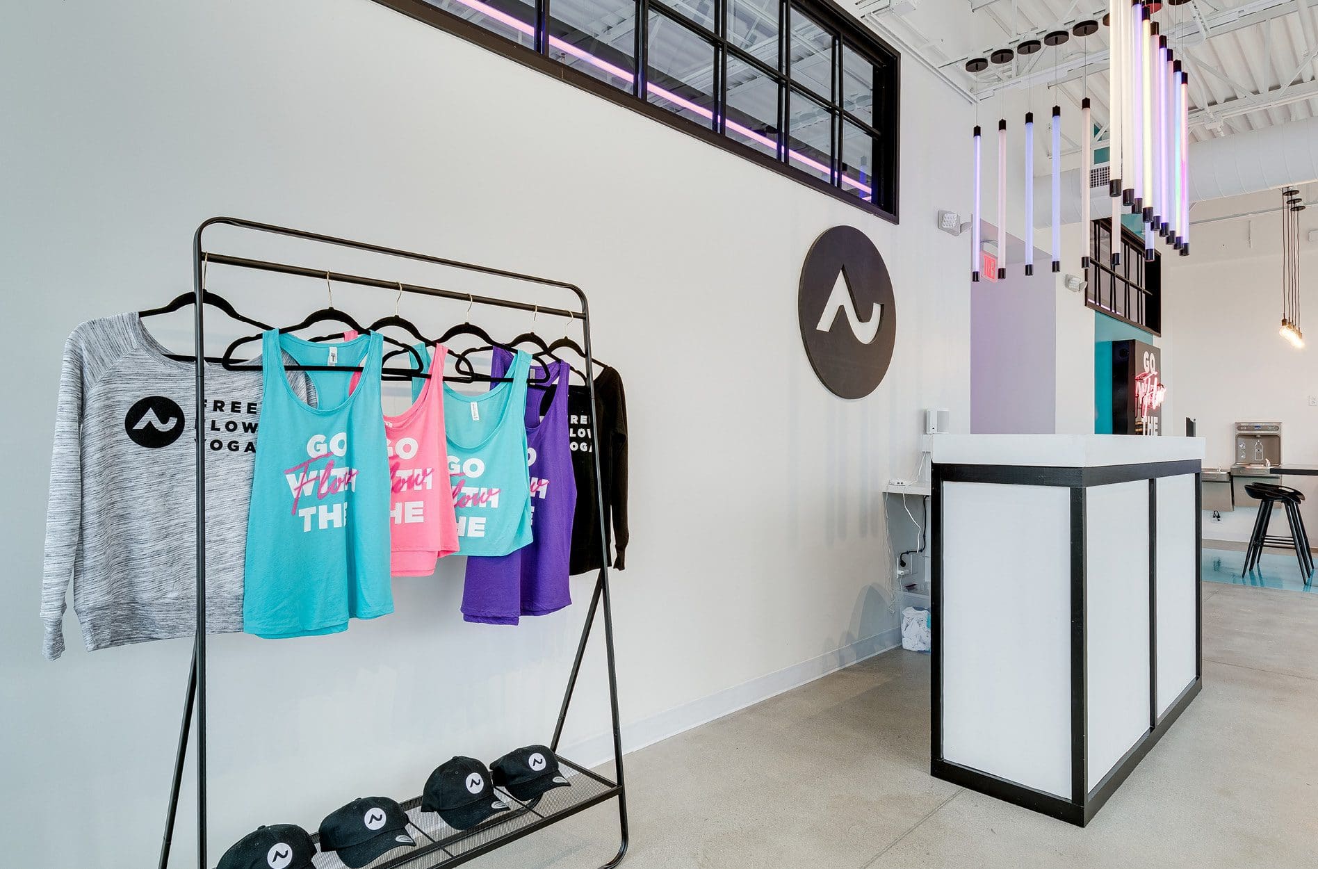
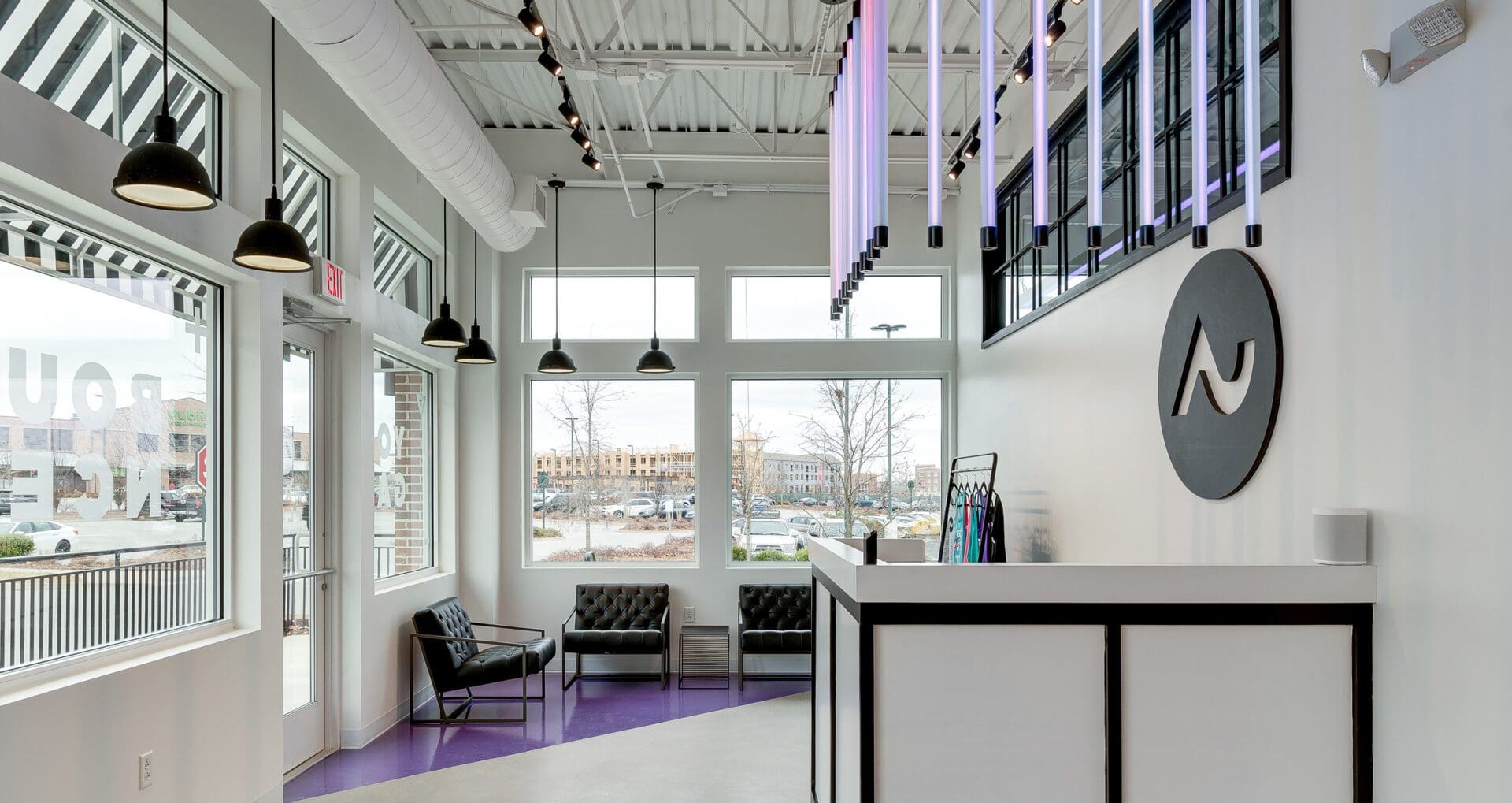
 These pendant lights continue along the front windows, wrapping around to the left of the reception area where we created another lounge space. This area features modern, minimal leather arm chairs atop a geometric purple floor graphic. Here, members can peruse merchandise displayed on an industrial black metal stand or connect with one another before or after a class.
 At the center of it all is a custom-designed reception desk that really makes an impression.
The check-in station is illuminated by fluorescent neon light bulbs hung vertically, directly above the L-shaped desk. The logo icon behind the desk welcomes members and communicates to them that they are in the right place.
 A hallway leading from the lobby to the rest of the studio presented a powerful opportunity to connect with members. We designed neon lighting that would travel vertically up one wall and across the ceiling in an inverted L shape.
The lights can be set to any brand color or programmed to rotate through colors throughout the day automatically. The Free Flow Yoga hallway lighting is truly a custom installation that makes quite an impact. Hand-painted floor graphics in this space reiterate the “go with the flow” mantra.
 At the end of the hall, members can enter the locker rooms or head into one of the two studios for a class.
In the locker rooms, wall graphics convey brand messaging to a captive audience. On the walls and in the showers, square tiles with black grout and matte black fixtures align with the overall look and feel. To maintain the neon-light-show aesthetic, we selected a brightly backlit round mirror.
 Just outside the locker rooms, we created a space for people to sit and blow dry their hair or do their makeup. This station is flooded with bright yellow and lit with updated 80s-style vanity lighting. Using the brand color on the walls and floors, we defined the area, creating usable space where there wasn’t any before.
 With the studios, we kept the aesthetic pretty neutral. But we also took advantage of certain elements to maintain the non-traditional aspect of this yoga studio branding project.
First, we installed drop lighting around the perimeter of the ceiling. These lights are adjustable in color and intensity. This custom lighting feature gives instructors the power to customize the environment to suit the class vibes.
Also, a large brand icon takes up one wall, while the other wall features a subtle application of geometric brand shapes. The inclusion of brand marks within the studio generates brand awareness and creates easy opportunities for branded social media shares.
 Overall, our selections for this space were modern and minimal. This approach allowed lighting to be the star of the show, effectively communicating Free Flow Yoga’s energetic, nontraditional, and welcoming vibe.
BRAND SUPPORT

WINDOW PAPER
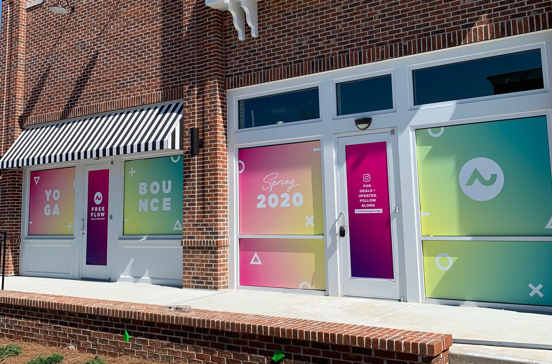
Strategic brand support is necessary to ensure that a brand doesn’t dismantle upon deployment. For Free Flow Yoga, like many of our clients, we created pre-opening window paper. These custom window graphics allow a new business (or one that’s remodeling) to put the brand on display for all to see. This creates excitement and anticipation and provides the company with an opportunity to advertise a special offer or a link to a landing page. Based on the window measurements, we created custom window graphics with the gradient floors to attract people’s attention passing by. Minimal typography conveyed brand messaging in a manner that would be easy to read from the street. Generating a buzz about a new business can be costly. Window graphics leverage an existing expense (rent payments during construction) to create an effective marketing opportunity.
YOGA STUDIO BRANDING | SOCIAL PACK
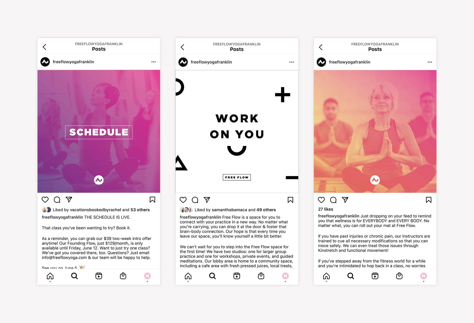
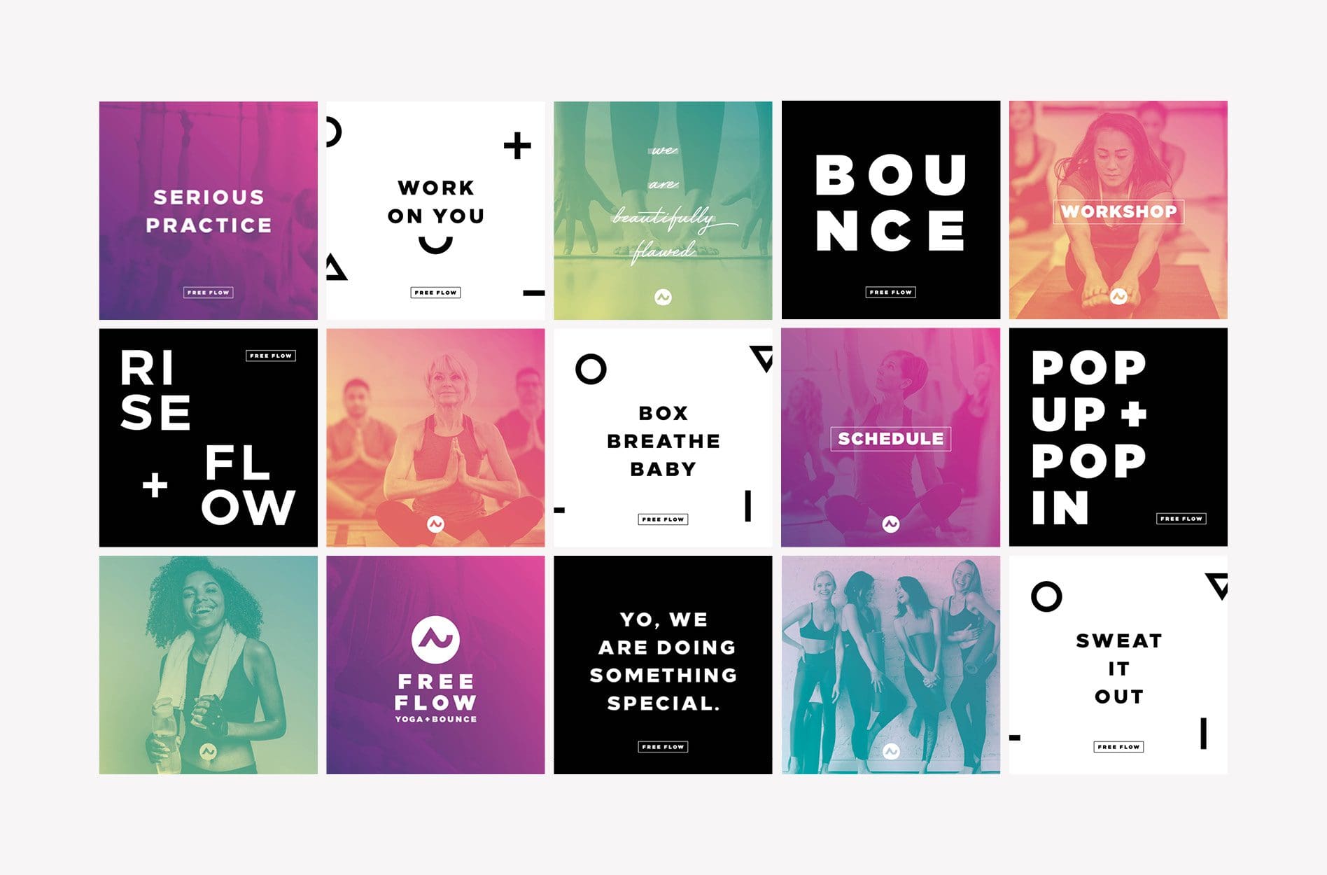
Social media plays a massive role in a brand’s ability to connect with consumers before, during, and after launch. For Free Flow Yoga, we created a Social Pack to equip the studio owners with social media graphics that build the brand and communicate key messages. The Social Pack includes 15 professionally-designed social squares, along with captions and hashtags. For Free Flow Yoga, we developed a social grid that would support the launch and provide direction for future social graphics. The art includes a combination of inspiring quotes, bold typography, and beautiful gradient overlay photos.

MERCHANDISE
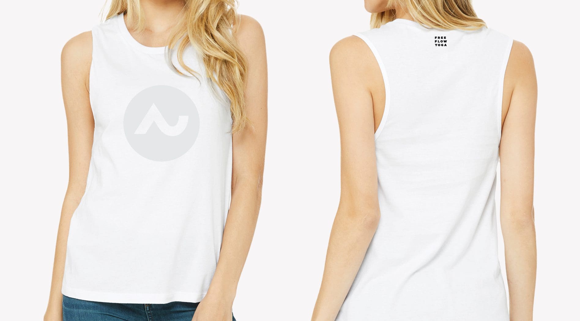
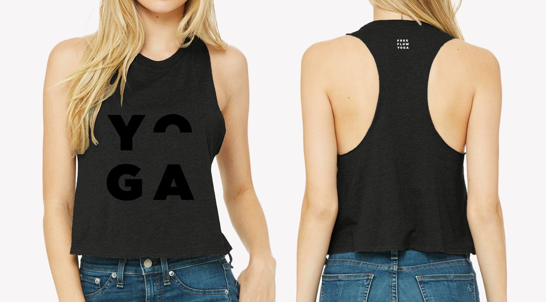
Fitness studio branding deserves merchandise that will turn members into walking (or running, or jumping, or bouncing, or posing) brand ambassadors. For Free Flow Yoga, we created tees, tanks, and water bottles to sell at the studio. The shirt design rivaled that of popular athleisure brands and featured bold typography to match in-studio signage. We also displayed the brand icon throughout the suite of attire to further brand awareness and create a cult-like following.