Logo Type and Why It Matters

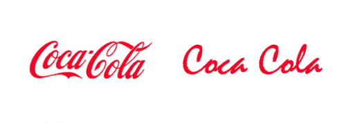
While browsing blogs on logo type over the holidays, we came across a great article from Pixelnomics. The article illustrates just how important font choice is during logo development. They showed side by side displays of unique vs. standard fonts used in different famous brand logos. The article explained how those changes impact the corporate look.
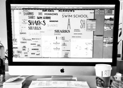
The whole point of designing a logo is to create a specific yet unique look for your company. This shouldn't be done by the owner of the company or a friend of a friend who owns a mac. It should be done by a professional who has a keen eye for typography and the different feelings that a logo type will evoke. Even once the logo type is typed out on the screen, the opportunities to tweak it are endless. Sometimes these details aren't even apparent until a standard font is placed next to a unique typeface, which is why we have a lot of clients that come in with a logo they made and ask us to create a brand around it. After some advisement and hesitation, a redesign is done on their current logo and (claps) we have yet to have one client revert back to their original logo design. What if Coca Cola just said "we want a script font and this was the best one we could find on our computer!" YIKES. Over here at Nice Branding Agency, we get that fonts and how you choose them can set your brand off on this foot or that. However, after attending a conference in San Francisco this past year on branding, we came to the realization that the more customized the font choice in a logo is, the more customized the logo is, adding to its appeal. We were left in complete and utter awe after hearing that Matteo Bologna, the owner of Mucca in New York City, creates a custom typeface for every logo he designs. Something to strive towards! Take a look at your logo... was it created in Microsoft Word or by your buddy who helped you start your business? If so, it might be time for a redesign to set your brand off on the right foot this year.


