
5 Guidelines for Great Design
When it comes to making your business stand out, design guidelines are key. With the right design principles in place, you can create an effective brand identity and build awareness of your business. In this blog post, we’ll explore five design guidelines that you can use to take your business to the next level. By following these simple steps, you’ll be able to create a successful and cohesive branding strategy that will be sure to draw the attention of your target audience.
- The Power of First Impressions
- The Psychology of Color
- The Importance of Typography
- The Balance of Whitespace
- The Rule of Thirds
The Power of First Impressions
When it comes to creating a successful business, the power of first impressions should never be underestimated. From the initial contact someone has with your brand to the way your product or service is presented, design plays an important role in creating that all-important first impression. Studies show that people form an opinion about something within seconds – whether that be your logo, website, or social media posts.
Creating an attractive, simple design and providing useful information, no matter the format, will capture the attention of those new to your brand and increase how long they interact with you.
The Psychology of Color
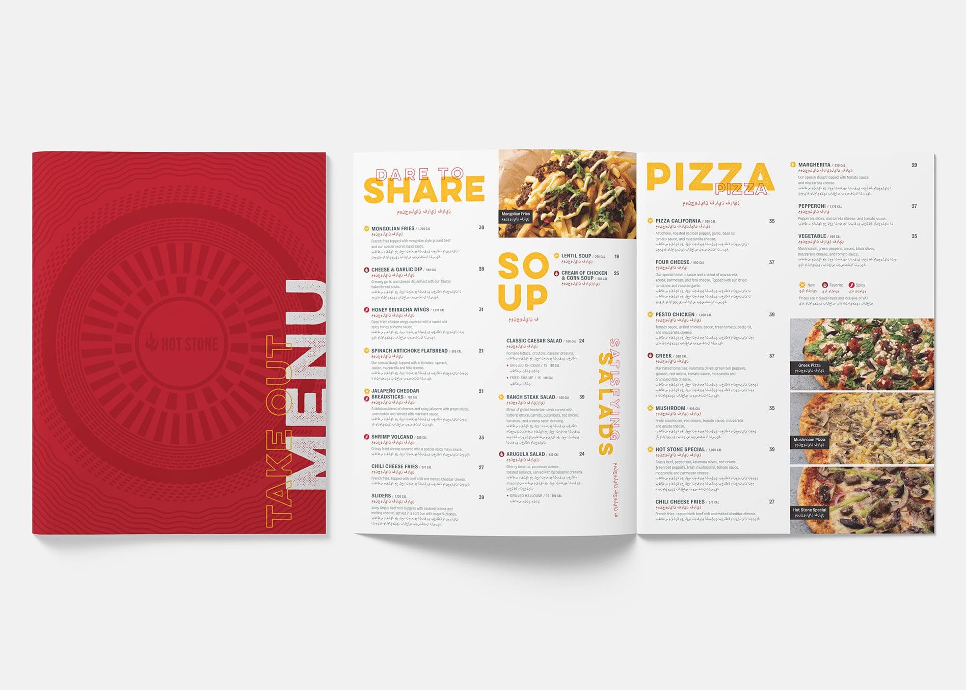
When deciding on colors for your design, it’s important to consider the psychological impact of color. Different colors evoke different emotions and feelings, which can affect how your audience perceives your brand. Understanding the psychology of color can help you create a more powerful design that resonates with your target audience.
Warm colors like red, yellow, and orange are associated with energy, excitement, and enthusiasm. Cool colors like blue, green, and purple are calming and soothing. Neutral colors like white, gray, and black offer a sense of balance and stability.
The Importance of Typography
Typography is a key element to any design as it keeps information legible and guides someone’s eye. When creating any design, you’ll need to keep your typography consistent as it quickly becomes a recognizable part of your brand that people recognize. This also helps with brand awareness and building trust with current and potential customers over time.
The Balance of Whitespace
Whitespace is what allows you to make your design look clean, polished, and professional. The importance of balance is obvious when you consider how much whitespace there is on either side of a door frame or window pane but it can be just as important in less obvious places too:
- A balanced layout will look more organized than an unbalanced one, which makes it easier for people to read and understand your content.
- The visual weight of elements within an image or illustration helps determine if they're positioned correctly on the page. If something looks like it's out-of-balance with its surroundings, then that might not be intentional (or even desirable).
The Rule of Thirds
The rule of thirds is a compositional rule of thumb in visual arts such as photography and painting and of course, design. The idea behind it is to divide an image into thirds both horizontally and vertically - and place important elements on those lines or intersections. This creates a stronger composition as it forces the viewer to focus on a specific area instead of letting their eyes wander around aimlessly.


