Teton Analytics is a real world data and evidence company based in St. Louis Park, Minnesota. They specialize in decades of hand-crafted healthcare data that empowers research, development, epidemiology, commercial, Health Economics and Outcomes Research (HEOR), and marketing teams looking to solve complex life science needs. As they did not have an established brand, we built them one in-house and created a website that reflects their actionable business.
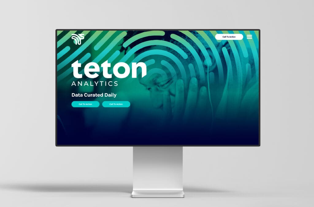
The website incorporates bold gradients to emphasize their unique, high-tech brand. Teton Analytics’ branding was created with a combination of tech-savvy and medical purposes in mind, allowing the data and services to highlight their validity in the industry space.
Project Kickoff: Business Branding
With every Nice Branding project, we begin with a discovery to get acquainted with the new client. To kickoff their Prime Branding Package, we started with a project kickoff call. This provides us with the essential background information for our strategists to study before we begin the brainstorming process. Teton Analytics’ Prime Branding Package included two unique brand boards, two unique logo designs, and a website to complement the chosen brand direction.
Design Direction Brainstorm
Teton Analytics wanted to create an established, recognizable brand for their business dedicated to real-time data, so that customers can feel comfortable and confident in using their analytics. In doing so, they wanted a gradient-based color palette to reflect the engaging and technical nature of their analytical business.
In creating our concepts, we focused on vibrant palettes that contained dynamic gradients of green, blue, yellow, orange, and pink. We also wanted to appeal to their demographic which is primarily healthcare workers who are looking for actionable data in order to better help their patients.
First Brand Concept Development
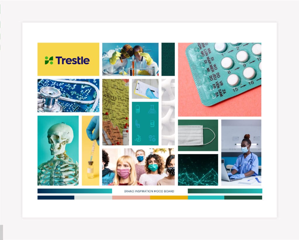
Brand Mood Board
As part of our Prime Branding Package, we developed a mood board that uses various images to convey the overall delivery of the company’s brand design. For Teton Analytics, our experts pulled images that are bold and versatile with connection and healthcare at the focus. We did this to capture the indication of validity and applicability that Teton Analytics was looking for in their branding. This is further reflected in the color palette which incorporates bright tones of blue, green, yellow and pink, along with white for some dimension.
Brand Logo Concept One
The logo for the first concept is the company name in easy to read, large font with some gradients to highlight their dynamic brand.
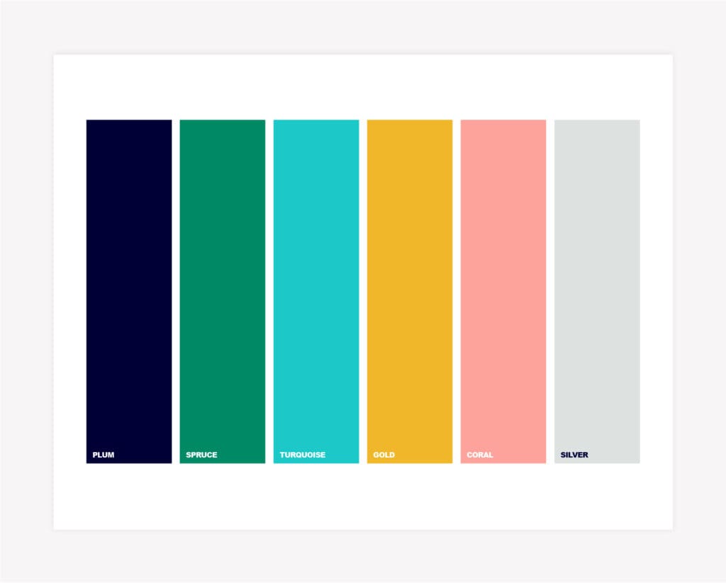
Brand Colors
The colors we chose are in line with the bright, fun branding Teton Analytics was looking for, with bold shades of blue, green, yellow, pink, and white to draw viewers in.
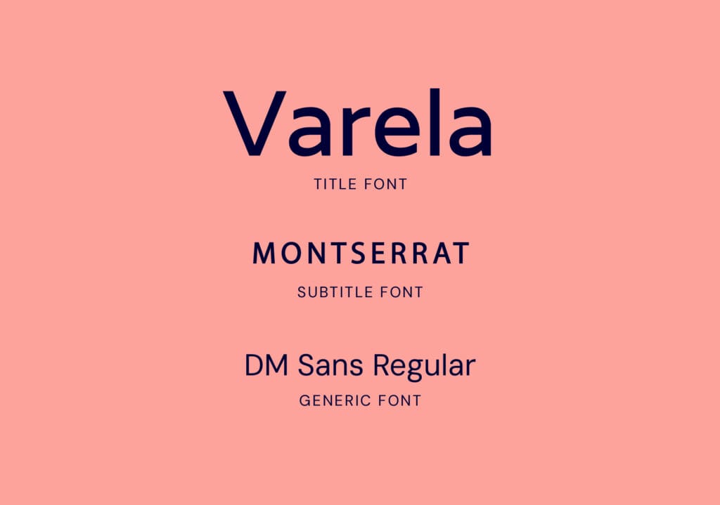
Brand Fonts
We selected these fonts to ensure that the text was easy to read across all materials, as well as engaging. We used Varela as the title font because its soft edges would stand out when used with the other font pairings. We used Montserrat as the subtitle font and DM Sans Regular as the generic font to emphasize the boldness of the brand.
Supporting Brand Icons
For the supporting icons, we created brand statements that reflect both Teton Analytics’ name and their mission of being an engaging company with digestible analytics. We paired the bright colors with fun, insightful patterns to create eye-catching icons.
Second Brand Concept Development
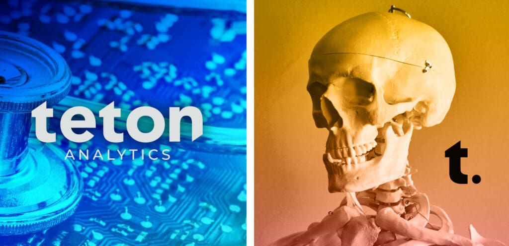
Mood Board
The second mood board we created focuses more on specific graphics and reflects what the brand is about. This includes the use of analytical images involving healthcare equipment and anatomy, as Teton Analytics’ main customers are those in the healthcare field.
Brand Logo Concept Two
For the second logo, we kept with a large, easy-to-read font so that it can be displayed in a variety of ways. We used different shades of blue to emphasize the dynamic nature of the brand.
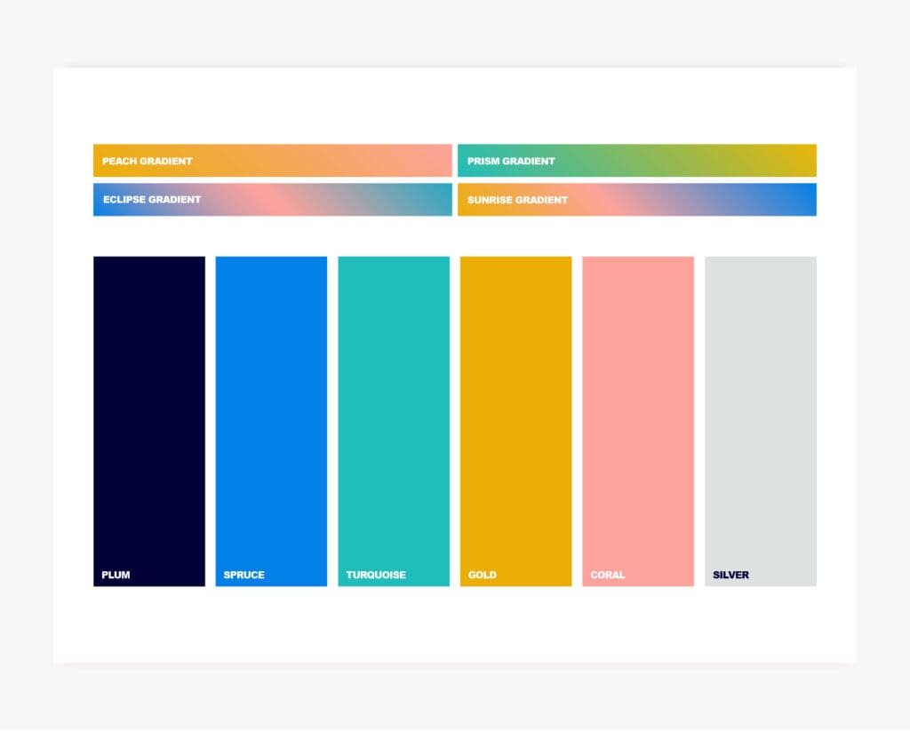
Brand Design Colors
The colors we choose include various shades of blue, as well as gold, coral, and silver. These colors are representative of a more modern and established analytics brand.
Brand Fonts
For this second concept, we went with Hubballi as the subtitle font and kept DM Sans Regular as the generic font. We used Trenda Bold for the title font as it’s both distinct and technical.
Supporting Icons
For these designs, we kept with the concept of eye-catching patterns and gradients, but incorporated more soothing undertones. This reflects the brand’s reliability in the space, as well as its boldness.
Presentation and Selection
Our Nice Branding Agency team of experts presented both brand design options to Teton Analytics. During this brand presentation, we walked our client through each conceptualization, sharing our thought processes behind each approach and selection.
Brand Logo Finalization
After our client provided their feedback and approved the final logo concept, the Nice team moved into wrapping up the logo design. Our team inspected all elements of the logo for excellence and precision.
Next, we formatted the final logo files in full color and black and white in JPEG, PNG, EPS, and PDF. We delivered the logo files to Teton Analytics accompanied with handy brand guidelines.
Logo Guidebook
Our brand design guidebook is a must-have tool to preserve the integrity of the brand. We delivered a professional booklet that includes the mood board, logo, supporting brand icons, official brand colors, and final brand typography.
Project Closeout
Teton Analytics was thrilled with our branding services, and our branding agency was delighted to have the opportunity to partner with this company.
Ready for a Nice Branding Design?
Are you dreaming of a captivating brand design for your cafe? Give us a call at 615.905.9936 so we can chat! Our Branding professionals are excited to create a custom project for you.
Connect with us on LinkedIn and Instagram to see more examples of our branding projects.


