Project Kickoff: Restaurant Branding
This Nice Branding project started with a discovery meeting to get acquainted with Men’s Pro Clinic. To kickoff their Prime Branding Package, we had a project kickoff call to collect any background information our brand strategists would need to further personalize the brainstorming process. Men’s Pro Clinic’s Prime Branding Package included a brand board, two logo designs, three supporting brand icons, custom website solutions, and more.
Design Direction Brainstorm
Men’s Pro Clinic wanted a website that was dynamic and comprehensive, emphasizing relatability and cohesiveness with simple, clean layouts and an approachable amount of content. They wanted a minimal layout with accessible information and an emphasis on personability, so users would feel more comfortable scheduling appointments.
When considering design concepts for Men’s Pro Clinic, we focused on keeping the layout clean and simple with an edge of masculinity and candidness. We decided to engage the target audience with discreet and relatable information, as well as sporty, tech-centric colors, images, and charts.
First Brand Concept Development
First Mood Board
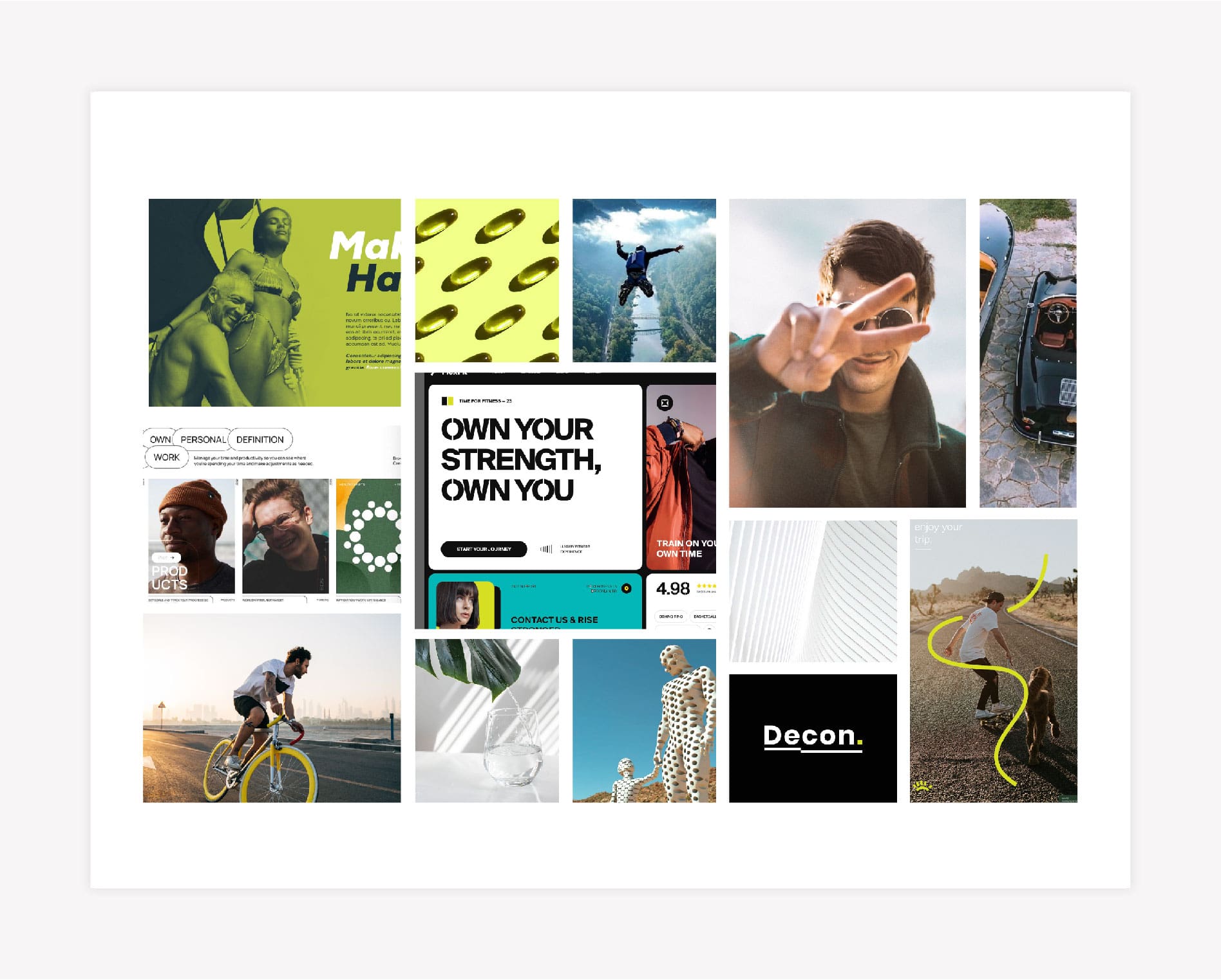
As part of our Prime Branding Package, we created a mood board using images that portrayed an active lifestyle and approachable branding. Our branding experts selected images that are simple and personable, with a focus on blue and green visuals. We pulled these images to hone in on the clinic’s everyday relatability and approachable atmosphere. This is expounded upon with the color palette of blues and greens.
Brand Logo Concept One
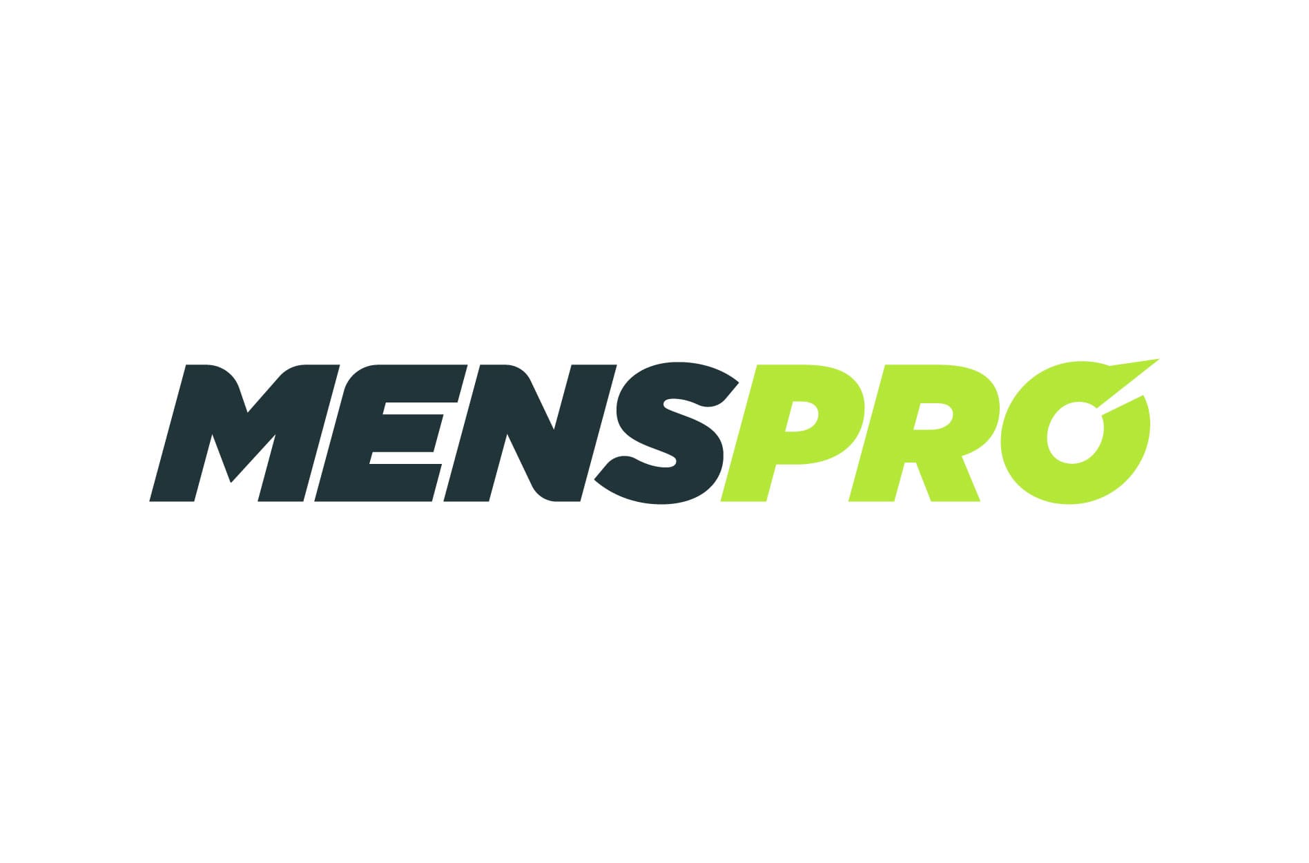
The logo design for the first concept is the business’ name in a sporty font with hues of both darker and lighter greens to highlight Men’s Pro Clinic’s dynamic nature.
Brand Colors
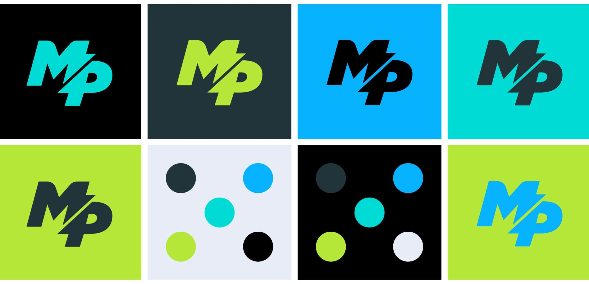
The colors our team selected reflected the image that Men’s Pro Clinic was going for, with bold shades of blues and greens, as well as black and silver to level it out.
Brand Fonts
The brand fonts have an edge of masculinity, with Gotham Ultra being the title font, Gotham Medium being the subtitle font, and Hard being the accent font. We chose these fonts because they represent the active, masculine branding of Men’s Pro Clinic.
Supporting Brand Icons
The supporting brand icons were made to showcase Men’s Pro Clinic’s playful, active, and approachable nature with fun, creative color combinations and icons. These supporting icons are meant to be energizing and playful.
Second Brand Concept Development
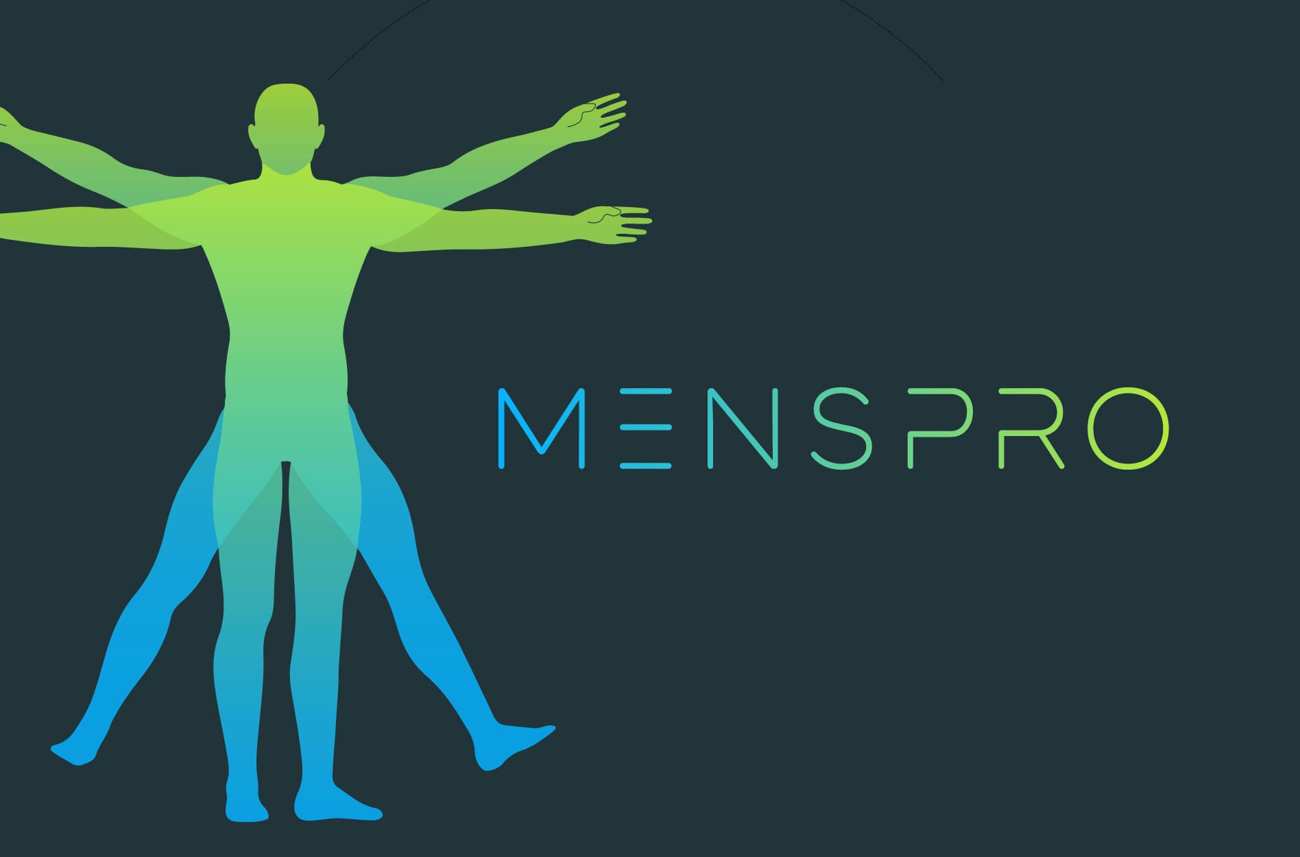
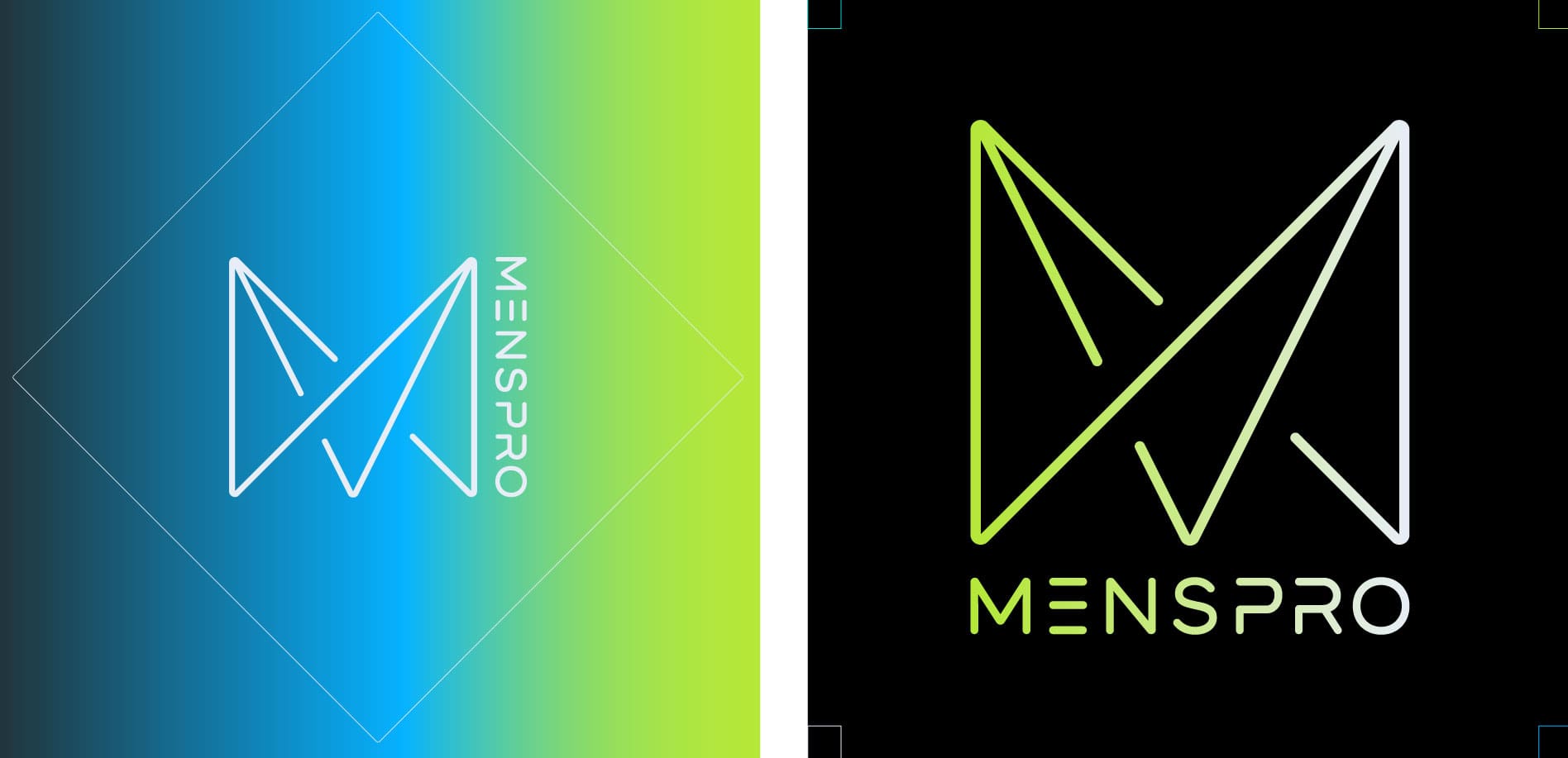
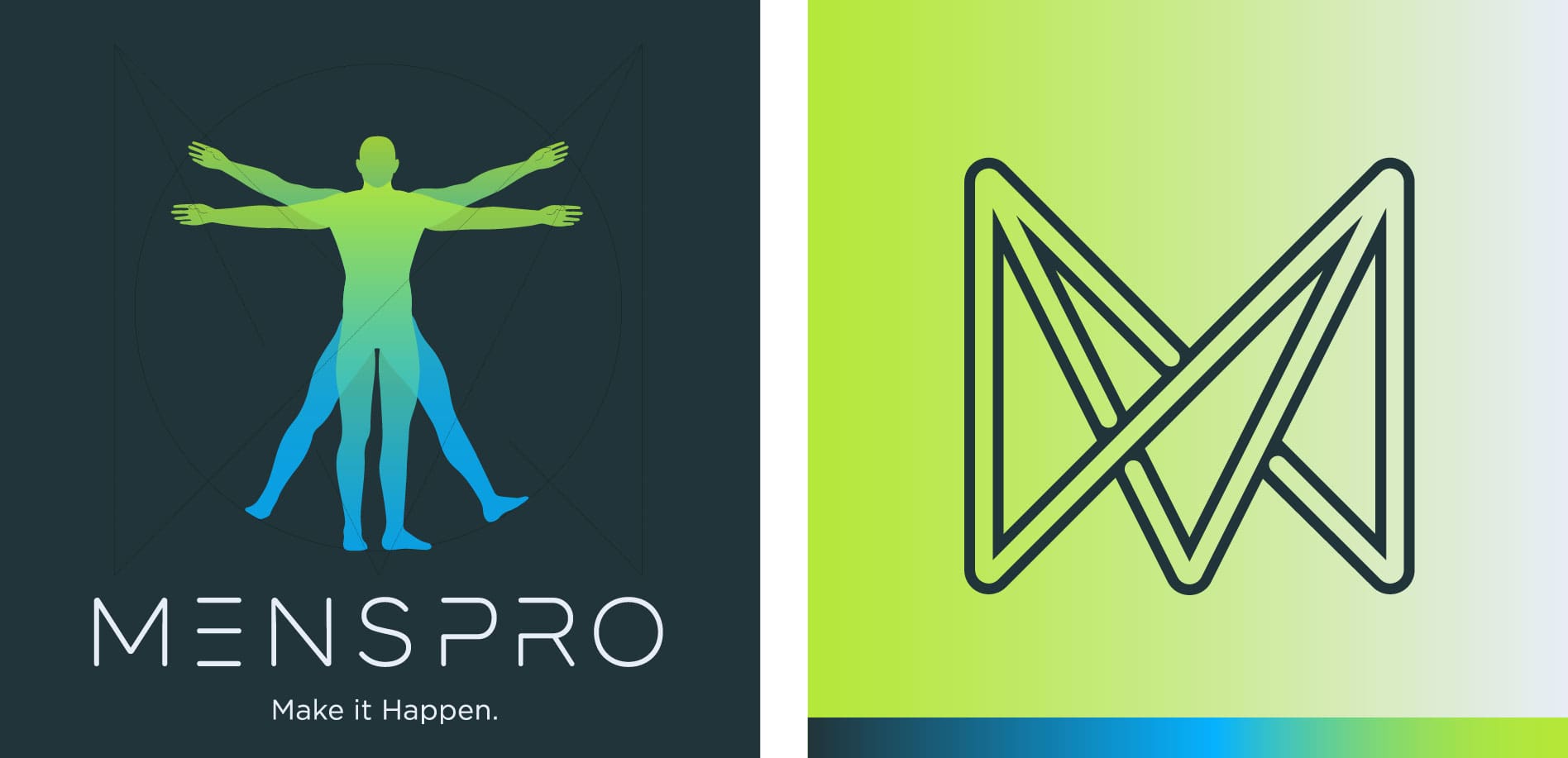
The second logo concept is more tech-focused with bright gradients and a futuristic font. This eye-catching logo uses minimalist design and neon colors to emphasize the knowledgeable and technological aspects of the brand.
Brand Fonts
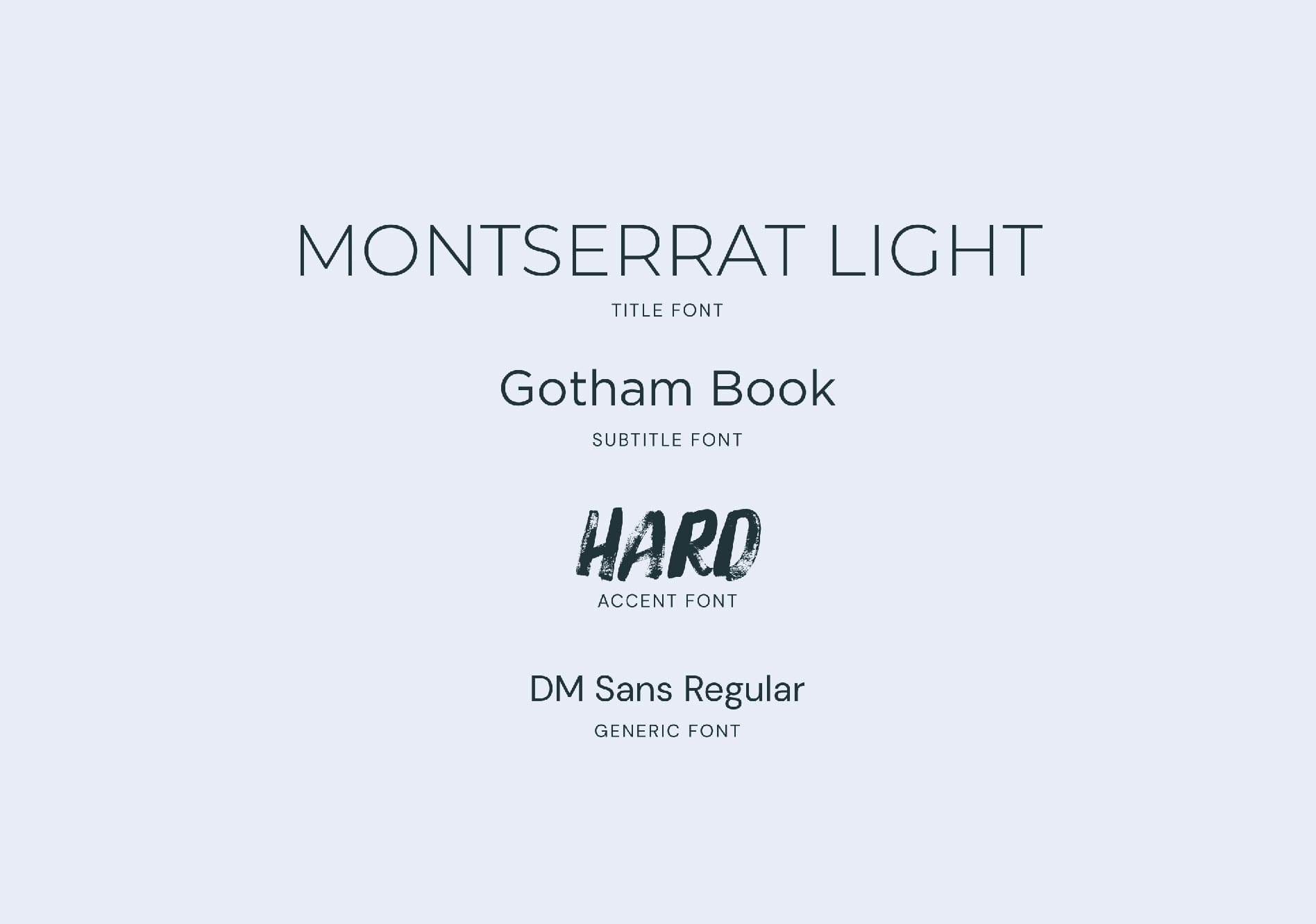
For the second concept, we chose Montserrat Light as the title font, Gotham Book as the subtitle font, and Hard as the accent font. These fonts keep the masculinity of the first concept, but taps into the high-tech aspect as well.
Supporting Brand Icons
For these supporting icons, we leaned into the experienced, scientific side of the clinic’s branding with creative logos and clean designs. These icons will support Men’s Pro Clinic as a brand that people can trust.
Presentation Excerpts and Selected Brand Direction
Our Nice Branding Agency team of experts presented the brand design options to Men’s Pro Clinic. During our brand presentation, we walked our client through each conceptualization, sharing our thought processes behind each approach and selection.
Brand Logo Finalization
After Men’s Pro Clinic provided some feedback and approved the final logo concept, the Nice team moved into wrapping up their logo design. Our team inspected all elements of the logo for excellence and precision.
Next, we formatted the final logo files in full color and black and white in PNG, EPS, and PDF. We delivered the logo files to Men’s Pro Clinic accompanied with handy brand guidelines.
Brand Guidebook
Our brand design guidebook is a must-have tool to preserve the integrity of the brand. Our team delivered a professional booklet that includes the mood board, logo, supporting brand icons, official brand colors, and final brand typography.
Project Closeout
Men’s Pro Clinic was pleased with our branding services, and our branding agency was honored to have the opportunity to partner with this local men’s health clinic.
Ready for a Nice Restaurant Brand Design
Are you dreaming of a captivating brand design for your business? Give us a call at 615.905.9936 so we can chat! Our branding professionals are excited to create a custom project for you.
Connect with us on LinkedIn and Instagram to see more examples of our branding projects.
