Burd Chicken Rice

Burd Chicken Rice is a fast-casual restaurant specializing in bringing Southeast Asia’s favorite comfort food to the mainstream. Called Bai Mon, Hainan Chicken, Com Ga, or Kao Gao, their chicken rice dish, along with the rest of their diverse menu is centered on simple and delicious quality ingredients.

The client’s goal was to develop their brand in a fun and engaging way that captures their traditional cuisine while highlighting their fresh and modern spin on Hainan Chicken and rice.

Project Kickoff: Restaurant Branding

As with every restaurant or cafe brand design process, we first begin with discovery activities to get our team acquainted with our client. In order to begin to deliver another amazing brand under a Restaurant Branding Package, we first ask our clients to participate in a project kickoff call. This provides us with essential background information. Our strategists study the information and our notes from previous sales meetings before we begin the brainstorming process. For Burd Chicken Rice, our Prime Branding Package included two unique brand boards, two unique logo designs, and a website to complement the chosen brand direction.

Design Direction Brainstorm

Owners, Channy and Dee, dreamed of setting up a spot that was trendy yet approachable. Their vision aimed to bring in those familiar with the traditional cuisine, as well as, introduce their home of West Covina, CA to a fresh and modern spin on Hainan Chicken and rice. In doing so, they wanted to focus on using bold colors and showcasing their two main offerings: sugar cane juice and Hainan Chicken.

In creating these concepts, we focused on colors such as pink, green, yellow, and red which all add a pop of color without being too overpowering. We also wanted to ensure that their brand appeals to anyone, no matter their experience with or knowledge of their cuisine.

First Brand Concept Development

The first restaurant brand direction that we presented explores a range of colors that captures their theme of rich, bold flavors while standing out from other restaurants. Images like the sugar cane and rice dish showcase their fresh ingredients, while the other images capture a familiar dining experience.
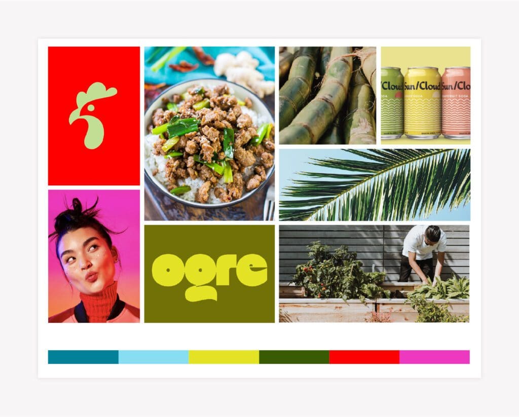
First Mood Board

As part of our Prime Branding Package, we developed a mood board that uses six images to convey the overall artistry of the restaurant brand design. For Burd Chicken Rice, our experts pulled from a variety of images that incorporate high contrast colors without being too busy.

Our mood board for this concept features imagery and typography that is reflected in the rest of the brand, and our images showcase the color palette of both their website and restaurant. We enjoyed playing with various elements that will help them stand out from what people think when they think about Southeast Asian food. Our branding experts created this concept while keeping their demographic in mind to create something both new and on trend.

Logo Concept One

For our first concept, our branding experts created a logo that uses their accent colors and captures their brand with a single, recognizable icon.

Colors

The colors we selected help set them apart from competitors by focusing on two high-contrast bold colors, red and yellow, that make an immediate impact on a viewer. In using color psychology as a branding strategy, we thought about how the color red and yellow are both associated with energy, strength, and attention.

Brand Fonts

We selected these fonts to ensure that the text was easy to read across all materials as they’re paired with high contrast colors. Arial Black is a contemporary Sans Serif font while the subtitle font, Lalezar, is the traditional typeface for Arabic and Latin popular culture. This combination further drives their mission appealing to all customers and combining the new with the familiar.

Supporting Brand Icons

Restaurant logos appear in a wide variety of places from coasters and napkins to menus and signage. To expand on Burd Chicken Rice’s brand, we created supporting brand icons that have distinct illustrations

Second Brand Concept Development

The second restaurant brand concept utilizes the colors blue, orange, and green as our main focus. It is tailored more towards a traditional Southeast Asian restaurant while still keeping their trendy approach.

Mood Board

In regards to the design aspect, our team incorporated elements in a mood board that can be used throughout their branding assets and interior selections. It features lighting with copper tones, fun colored drinks, and food with green herbs.

Logo Concept Two

For the main logo for brand concept two, we choose the same image but instead paired red and green. Red serves as the icon color and subtitle color, while the green of the main text creates a contrast. 

Design Colors

The three brand colors we chose for this color palette are all shades of blue. We choose this as in color psychology, blue is largely associated with communicating trust, loyalty, and cleanliness. The darkest tone we selected is deep denim with dusty blue as the lightest color and charcoal blue as our middle tone.

Brand Fonts

For their second brand direction, we wanted to use typography that, again, appeals to everyone while capturing their brand in a fun way. We liked the pairing of the more curved letters the title font, Bilagro Black, has while the subtitle font is more straight and structured.

Supporting Icons

Ready for a Nice Restaurant Branding Design

Are you dreaming of a captivating brand design for your cafe? Give us a call at 615.905.9936 so we can chat over a good, strong cuppa. Our Prime Restaurant Branding professionals are ready to whisk up something especially just for you.

Connect with us on LinkedIn and Instagram to see more examples of our branding projects.